Exploratory Data Analysis
Stuart Miller August 4, 2019
Setup Environment
# import libraries
library(knitr)
library(tidyverse)
library(naniar)
library(Hmisc)
library(GGally)
library(gridExtra)
library(RColorBrewer)
library(gplots)
library(corrplot)
library(ggthemes)

# import helper functions
source('../helper/data_munging.R')
source('../helper/visual.R')

# read in data
train <- read_csv('../data/CaseStudy2-data_train.csv')
Data Exploration
A data dictionary was not given. So start by exploring the variables to get a sense of what is included. A simple data dictionary will be built. See ‘./analysis/data/README.md’ for more details.
names(train)
##  [1] "ID"                       "Age"
##  [3] "Attrition"                "BusinessTravel"
##  [5] "DailyRate"                "Department"
##  [7] "DistanceFromHome"         "Education"
##  [9] "EducationField"           "EmployeeCount"
## [11] "EmployeeNumber"           "EnvironmentSatisfaction"
## [13] "Gender"                   "HourlyRate"
## [15] "JobInvolvement"           "JobLevel"
## [17] "JobRole"                  "JobSatisfaction"
## [19] "MaritalStatus"            "MonthlyIncome"
## [21] "MonthlyRate"              "NumCompaniesWorked"
## [23] "Over18"                   "OverTime"
## [25] "PercentSalaryHike"        "PerformanceRating"
## [27] "RelationshipSatisfaction" "StandardHours"
## [29] "StockOptionLevel"         "TotalWorkingYears"
## [31] "TrainingTimesLastYear"    "WorkLifeBalance"
## [33] "YearsAtCompany"           "YearsInCurrentRole"
## [35] "YearsSinceLastPromotion"  "YearsWithCurrManager"
Reponse Variables
Two models are requested
- A model for salary, which is given as
MonthlyIncomein the dataset. - A model for attrition, which is given as
Attritionin the dataset.
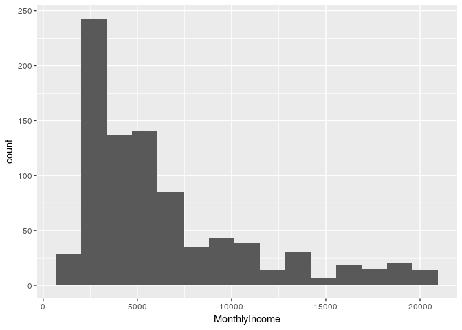
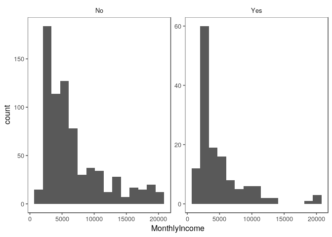
Histogram of monthly income reveals that it is highly skewed to the right.
# histogram of MonthlyIncome
train %>% ggplot(aes(x = MonthlyIncome)) +
  geom_histogram(bins = 15)
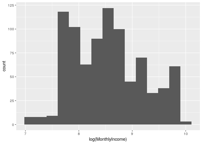
# histogram of MonthlyIncome
train %>% ggplot(aes(x = log(MonthlyIncome))) +
  geom_histogram(bins = 15)
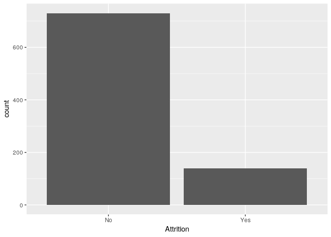
A bar plot of Attrition reveals that the response variable is highly imbalanced.
# histogram of Attrition
train %>% ggplot(aes(x = Attrition)) +
  geom_bar()
Explanatory - Continuous Variables
Exploration of the continuous variables.
# create a vector of numeric features
features.numeric <- c('DailyRate', 'DistanceFromHome', 'Age', 'HourlyRate', 'MonthlyIncome', 'MonthlyRate',
           'NumCompaniesWorked','PercentSalaryHike', 'TotalWorkingYears', 'TrainingTimesLastYear',
           'YearsAtCompany','YearsInCurrentRole','YearsSinceLastPromotion', 'YearsWithCurrManager')
Explore features in isolation and the relationship between features and the response variables.
Correlation to Response
The following table ranks features in order of descending correlation to
MonthlyIncome.
train.numeric <- train %>% select(features.numeric)

correlation.matrix <- rcorr(as.matrix(train.numeric))
train.corToMI <- data.frame(flattenCorrMatrix(correlation.matrix$r, correlation.matrix$P)) %>%
  filter(row == 'MonthlyIncome' | column == 'MonthlyIncome') %>%
  mutate(cor = abs(cor)) %>%
  arrange(-cor)
kable(train.corToMI)
| row | column | cor | p |
|---|---|---|---|
| MonthlyIncome | TotalWorkingYears | 0.7785112 | 0.0000000 |
| MonthlyIncome | YearsAtCompany | 0.4913790 | 0.0000000 |
| Age | MonthlyIncome | 0.4842883 | 0.0000000 |
| MonthlyIncome | YearsInCurrentRole | 0.3618405 | 0.0000000 |
| MonthlyIncome | YearsWithCurrManager | 0.3284875 | 0.0000000 |
| MonthlyIncome | YearsSinceLastPromotion | 0.3159116 | 0.0000000 |
| MonthlyIncome | NumCompaniesWorked | 0.1558943 | 0.0000038 |
| MonthlyIncome | MonthlyRate | 0.0645941 | 0.0568449 |
| MonthlyIncome | PercentSalaryHike | 0.0538659 | 0.1123575 |
| MonthlyIncome | TrainingTimesLastYear | 0.0390146 | 0.2503303 |
| DistanceFromHome | MonthlyIncome | 0.0066672 | 0.8443188 |
| HourlyRate | MonthlyIncome | 0.0023912 | 0.9438534 |
| DailyRate | MonthlyIncome | 0.0000879 | 0.9979342 |
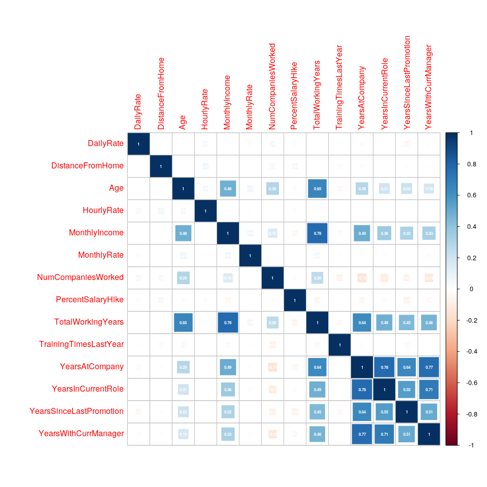
Correlation Heatmap
TotalworkingYears, Age, YearsAtCompany, YearsInCurrentRole, and
YearsWithCurrentManager.
heatmap.cor <- function(df){
  df %>%
    keep(is.numeric) %>%
    drop_na() %>%
    cor %>%
    corrplot( addCoef.col = 'white',
             number.digits = 2,
             number.cex = 0.5,
             method = 'square')
}
heatmap.cor(train.numeric)
Variance of Features
The following table ranks features in order of descending standard deviation.
# get varaince table
temp.table <- train %>%
  select(features.numeric) %>%
  summarise_all(funs(sd(.))) %>%
  rownames_to_column %>%
  gather(var, value, -rowname) %>%
  arrange(-value) %>%
  select(-one_of(c('rowname')))
# rename columns for clairity and print markdown table
names(temp.table) <- c('Feature','Standard Deviation')
kable(temp.table)
| Feature | Standard Deviation |
|---|---|
| MonthlyRate | 7108.381928 |
| MonthlyIncome | 4597.695974 |
| DailyRate | 401.116280 |
| HourlyRate | 20.127163 |
| Age | 8.925950 |
| DistanceFromHome | 8.136704 |
| TotalWorkingYears | 7.513668 |
| YearsAtCompany | 6.021036 |
| PercentSalaryHike | 3.675440 |
| YearsInCurrentRole | 3.639317 |
| YearsWithCurrManager | 3.574441 |
| YearsSinceLastPromotion | 3.185872 |
| NumCompaniesWorked | 2.520443 |
| TrainingTimesLastYear | 1.272665 |
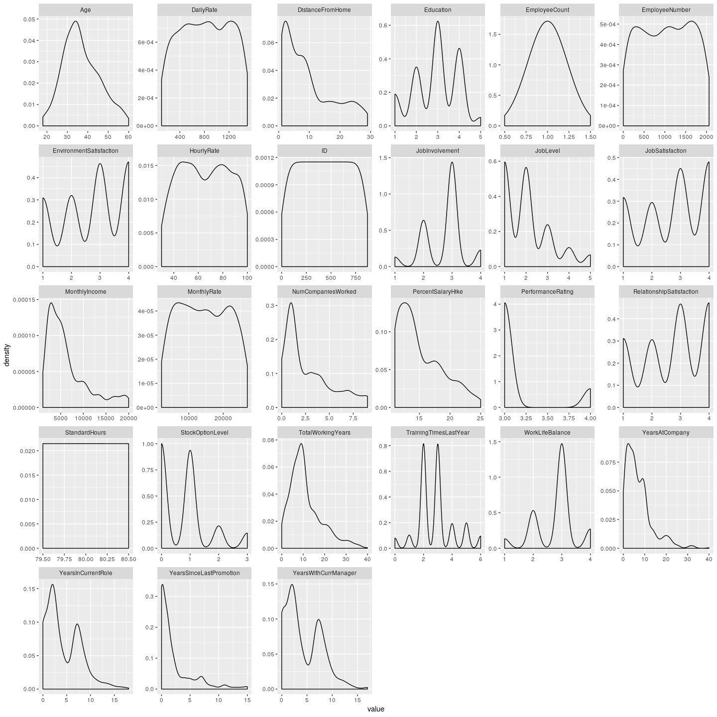
Density Plots of All Numeric Features
train %>% keep(is.numeric) %>%
  gather() %>%
  ggplot(aes(x = value)) +
  facet_wrap(~ key, scales = 'free') +
  geom_density()
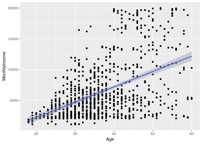
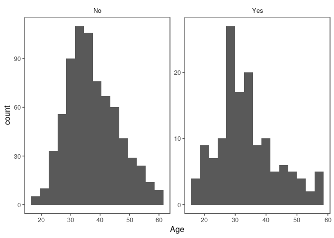
Age exploration
There appears to be a relationship between Age and MonthlyIncome. A
relationship between Age and Attrition is not clear.
train %>% ggplot(aes(x = Age)) +
  geom_histogram(bins = 15)
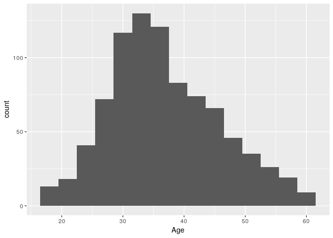
train %>% ggplot(aes(x = Age)) +
  geom_histogram(bins = 15) +
  facet_wrap(~ Attrition)
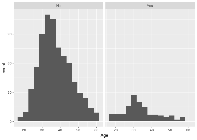
train %>% ggplot(aes(x = Age, y = MonthlyIncome)) +
  geom_point() + geom_smooth(method = 'lm')
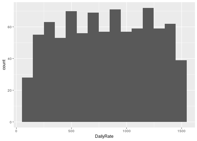
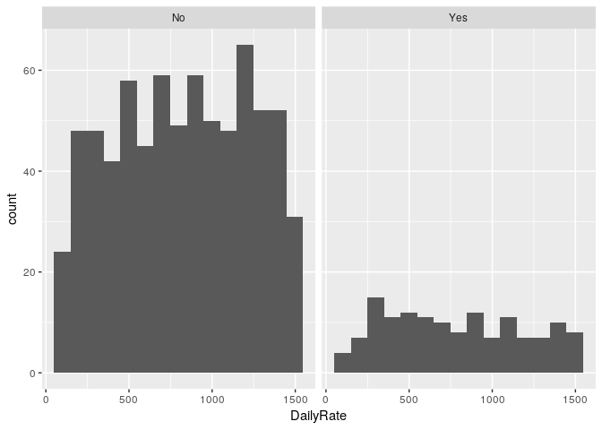
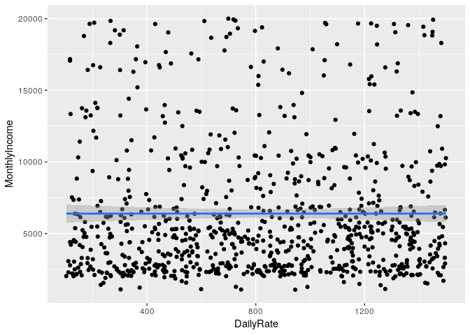
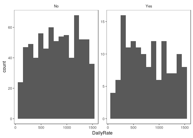
DailyRate exploration
There does not appear to be a correlation between DailyRate and either
outcome variable.
train %>% ggplot(aes(x = DailyRate)) +
  geom_histogram(bins = 15)
train %>% ggplot(aes(x = DailyRate)) +
  geom_histogram(bins = 15) +
  facet_wrap(~ Attrition)
train %>% ggplot(aes(x = DailyRate, y = MonthlyIncome)) +
  geom_point() + geom_smooth(method = 'lm')
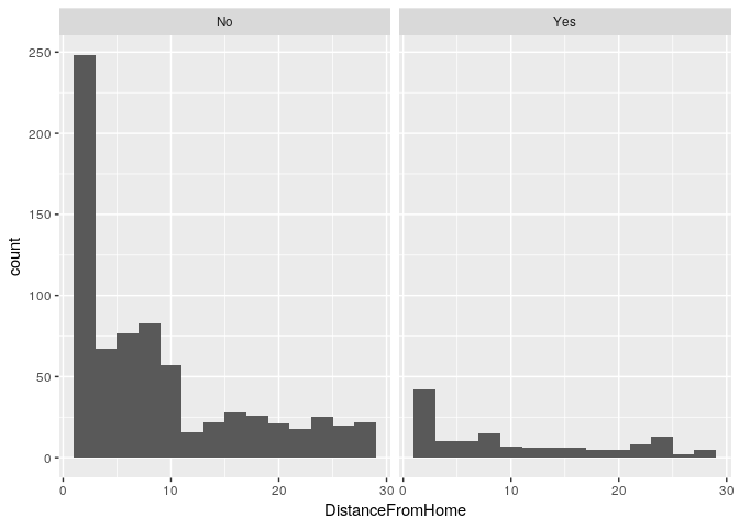
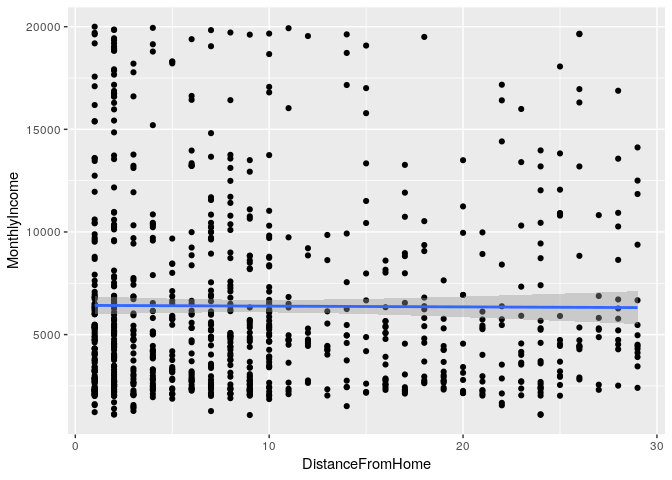
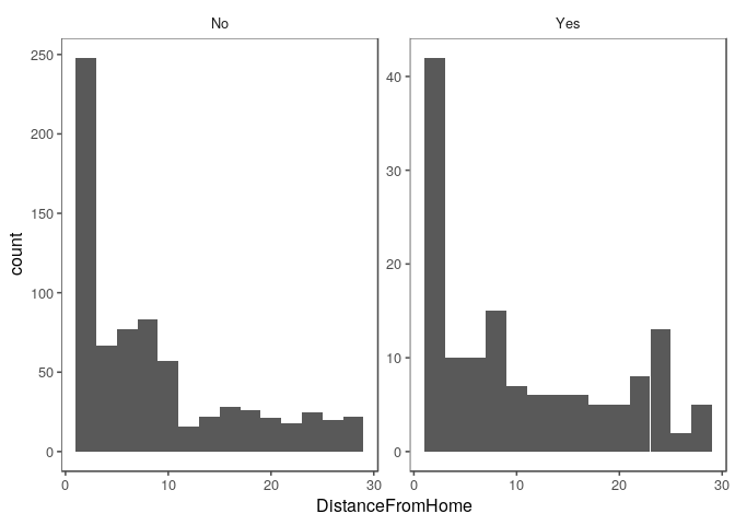
DistanceFromHome exploration
There does not appear to be a correlation between DistanceFromHome and
either outcome variable.
train %>% ggplot(aes(x = DistanceFromHome)) +
  geom_histogram(bins = 15)
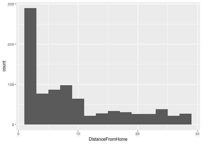
train %>% ggplot(aes(x = DistanceFromHome)) +
  geom_histogram(bins = 15) +
  facet_wrap(~ Attrition)
train %>% ggplot(aes(x = DistanceFromHome, y = MonthlyIncome)) +
  geom_point() + geom_smooth(method = 'lm')
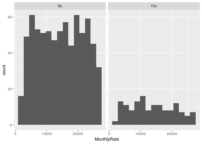
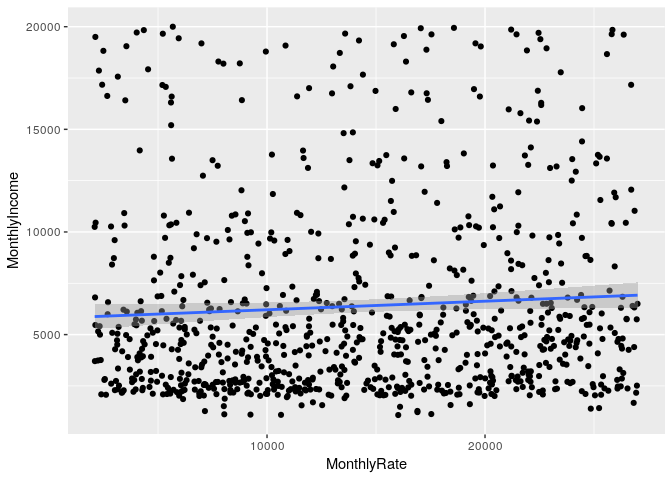
MonthlyRate exploration
There does not appear to be a correlation between MonthlyRate and
either outcome variable.
train %>% ggplot(aes(x = MonthlyRate)) +
  geom_histogram(bins = 15)
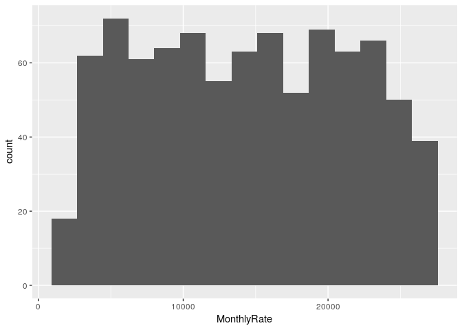
train %>% ggplot(aes(x = MonthlyRate)) +
  geom_histogram(bins = 15) +
  facet_wrap(~ Attrition)
train %>% ggplot(aes(x = MonthlyRate, y = MonthlyIncome)) +
  geom_point() + geom_smooth(method = 'lm')
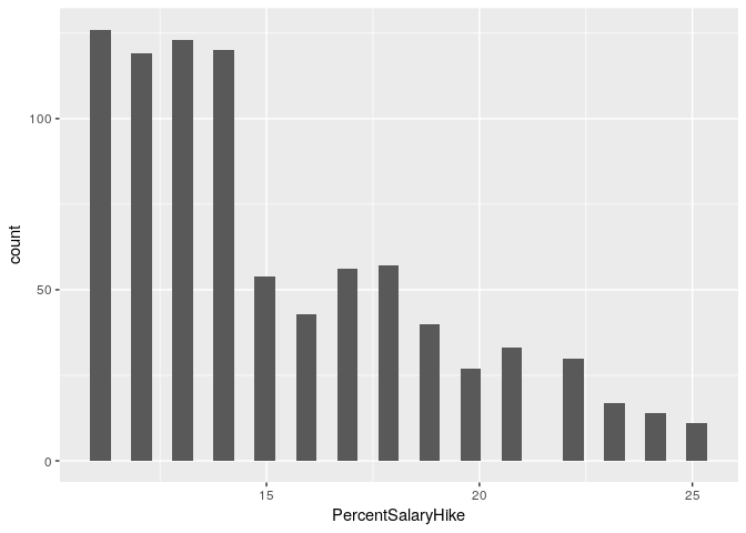
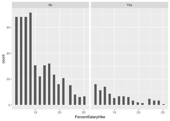
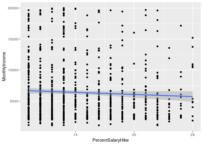
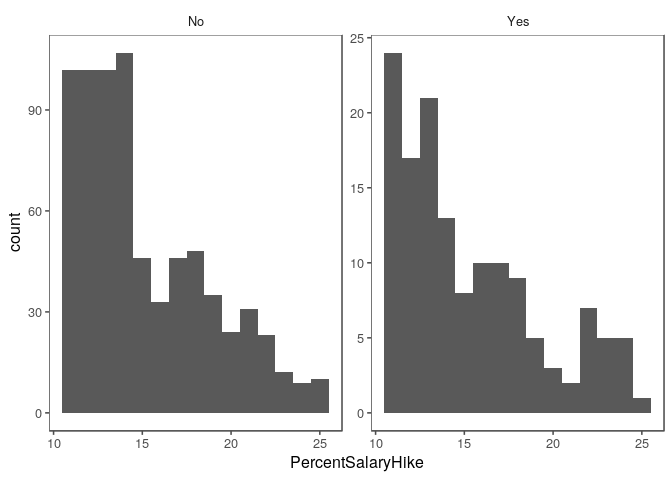
PercentSalaryHike exploration
There does not appear to be a correlation between PercentSalaryHike
and either outcome variable.
train %>% ggplot(aes(x = PercentSalaryHike)) +
  geom_histogram()
## `stat_bin()` using `bins = 30`. Pick better value with `binwidth`.
train %>% ggplot(aes(x = PercentSalaryHike)) +
  geom_histogram() +
  facet_wrap(~ Attrition)
## `stat_bin()` using `bins = 30`. Pick better value with `binwidth`.
train %>% ggplot(aes(x = PercentSalaryHike, y = MonthlyIncome)) +
  geom_point() + geom_smooth(method = 'lm')
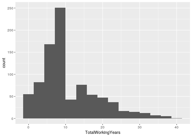
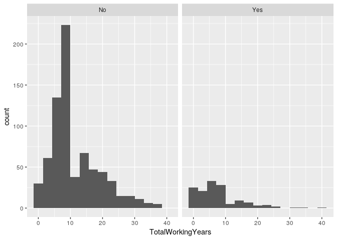
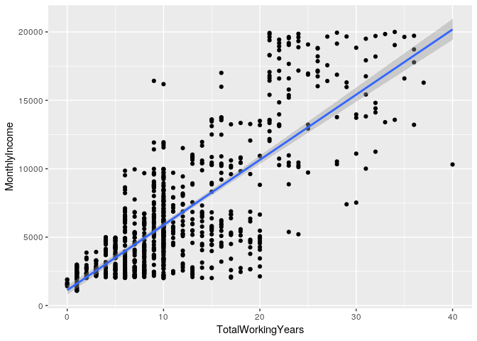
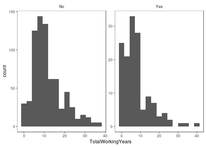
TotalWorkingYears exploration
There does appear to be a correlation between TotalWorkingYears and
MonthlyIncome.
train %>% ggplot(aes(x = TotalWorkingYears)) +
  geom_histogram(bins = 15)
train %>% ggplot(aes(x = TotalWorkingYears)) +
  geom_histogram(bins = 15) +
  facet_wrap(~ Attrition)
train %>% ggplot(aes(x = TotalWorkingYears, y = MonthlyIncome)) +
  geom_point() + geom_smooth(method = 'lm')
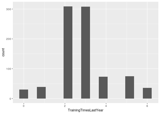
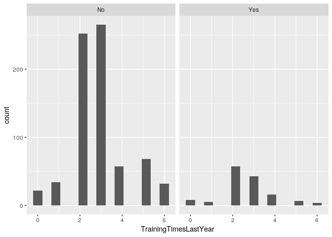
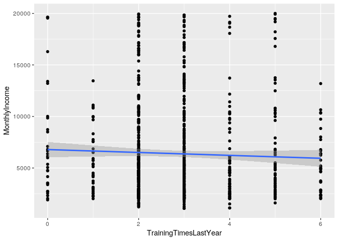
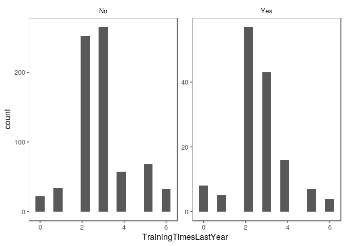
TrainingTimesLastYear exploration
There does not appear to be a correlation between
TrainingTimesLastYear and either outcome variable.
train %>% ggplot(aes(x = TrainingTimesLastYear)) +
  geom_histogram(bins = 15)
train %>% ggplot(aes(x = TrainingTimesLastYear)) +
  geom_histogram(bins = 15) +
  facet_wrap(~ Attrition)
train %>% ggplot(aes(x = TrainingTimesLastYear, y = MonthlyIncome)) +
  geom_point() + geom_smooth(method = 'lm')
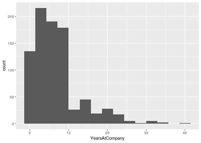
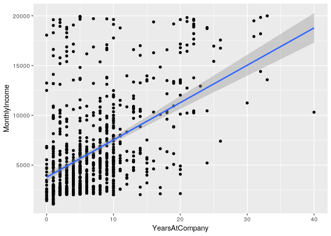
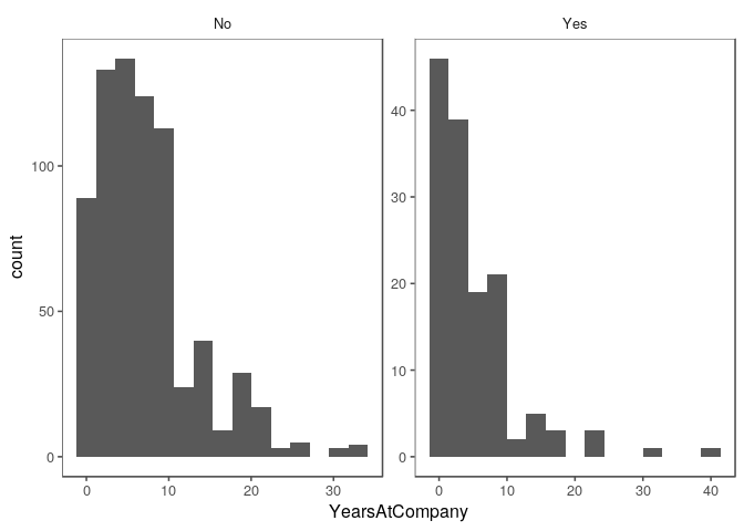
YearsAtCompany exploration
There does appear to be a correlation between YearsAtCompany and
MonthlyIncome.
train %>% ggplot(aes(x = YearsAtCompany)) +
  geom_histogram(bins = 15)
train %>% ggplot(aes(x = YearsAtCompany)) +
  geom_histogram(bins = 15) +
  facet_wrap(~ Attrition)
train %>% ggplot(aes(x = YearsAtCompany, y = MonthlyIncome)) +
  geom_point() + geom_smooth(method = 'lm')
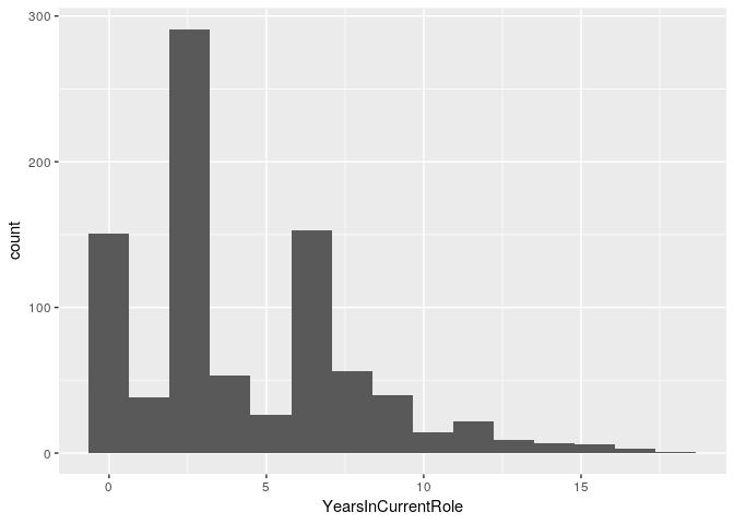
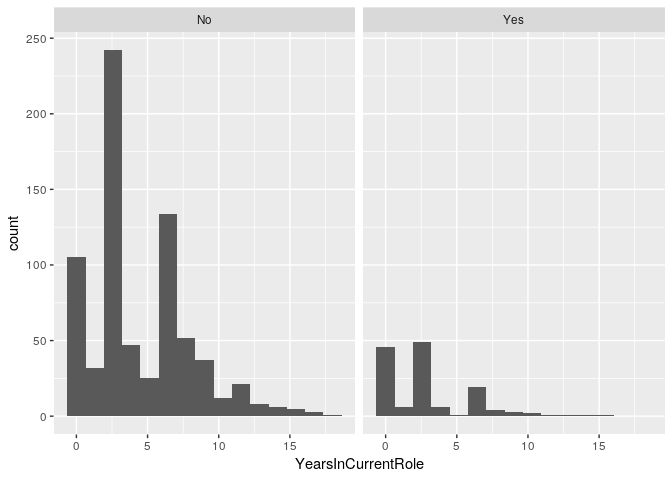
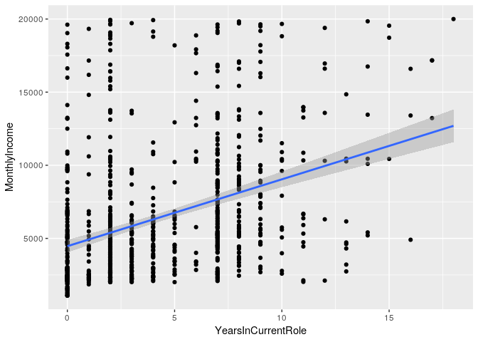
YearsInCurrentRole exploration
There does appear to be a correlation between YearsInCurrentRole and
MonthlyIncome.
train %>% ggplot(aes(x = YearsInCurrentRole)) +
  geom_histogram(bins = 15)
train %>% ggplot(aes(x = YearsInCurrentRole)) +
  geom_histogram(bins = 15) +
  facet_wrap(~ Attrition)
train %>% ggplot(aes(x = YearsInCurrentRole, y = MonthlyIncome)) +
  geom_point() + geom_smooth(method = 'lm')
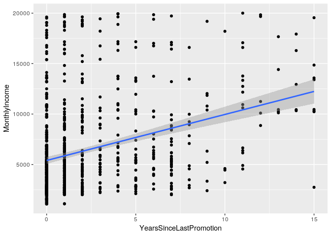
YearsSinceLastPromotion exploration
There does appear to be a correlation between YearsSinceLastPromotion
and MonthlyIncome.
train %>% ggplot(aes(x = YearsSinceLastPromotion)) +
  geom_histogram(bins = 15)
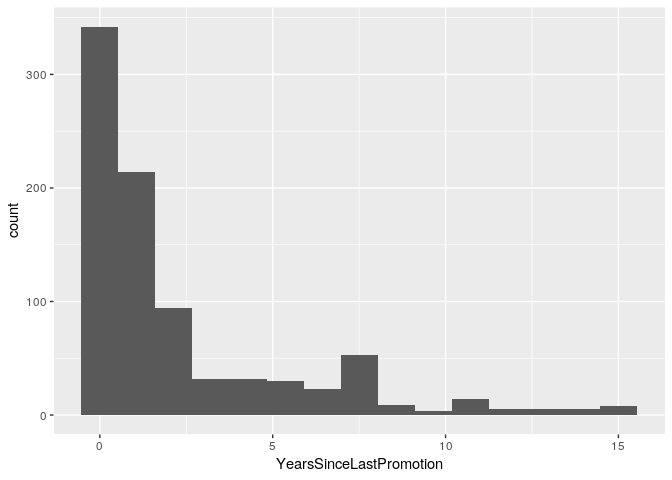
train %>% ggplot(aes(x = YearsSinceLastPromotion)) +
  geom_histogram(bins = 15) +
  facet_wrap(~ Attrition)
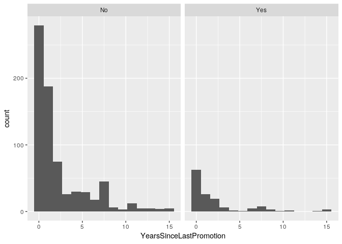
train %>% ggplot(aes(x = YearsSinceLastPromotion, y = MonthlyIncome)) +
  geom_point() + geom_smooth(method = 'lm')
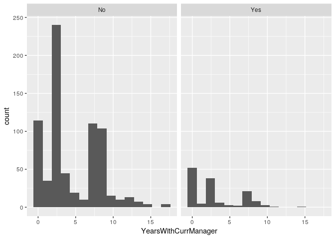
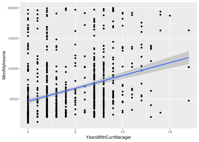
YearsWithCurrManager exploration
There does not appear to be a correlation between YearsWithCurrManager
and either outcome variable.
train %>% ggplot(aes(x = YearsWithCurrManager)) +
  geom_histogram(bins = 15)
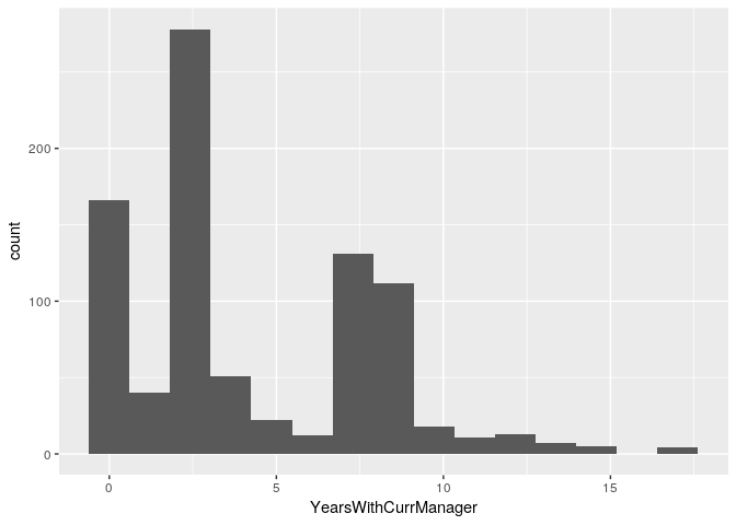
train %>% ggplot(aes(x = YearsWithCurrManager)) +
  geom_histogram(bins = 15) +
  facet_wrap(~ Attrition)
train %>% ggplot(aes(x = YearsWithCurrManager, y = MonthlyIncome)) +
  geom_point() + geom_smooth(method = 'lm')
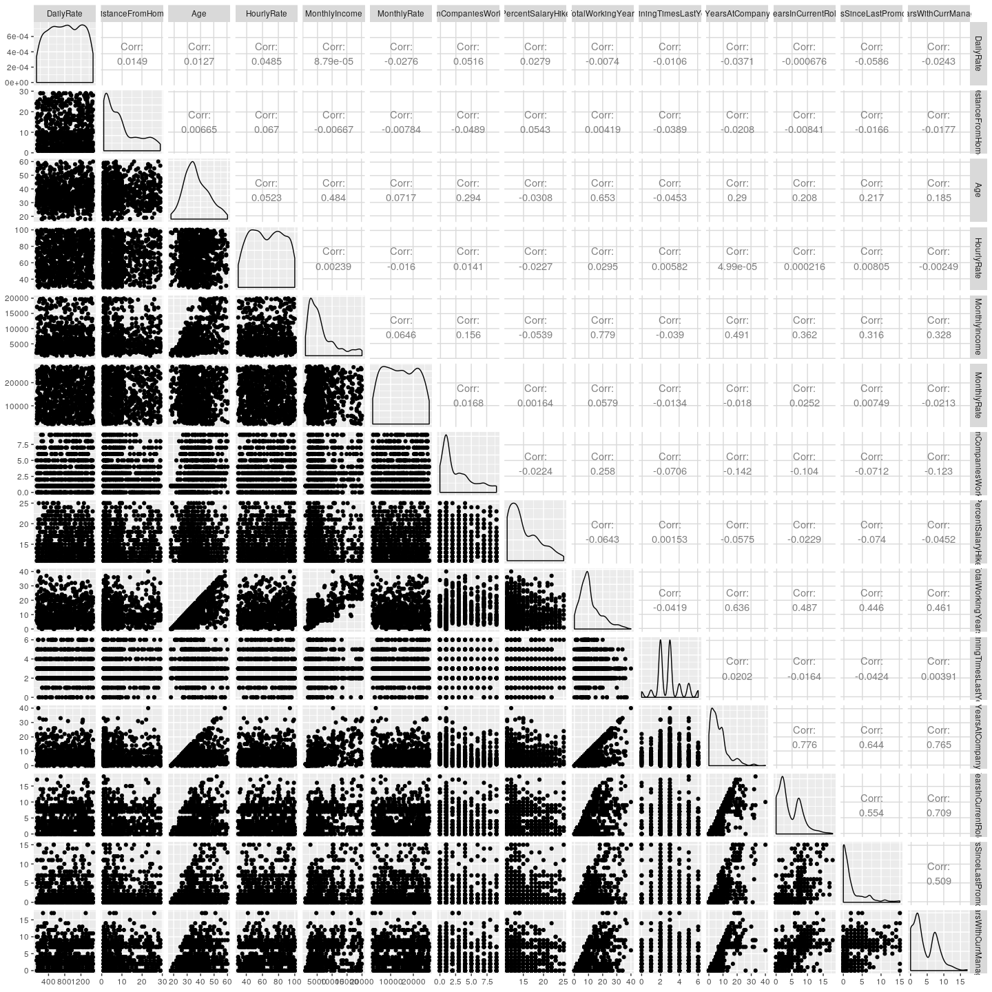
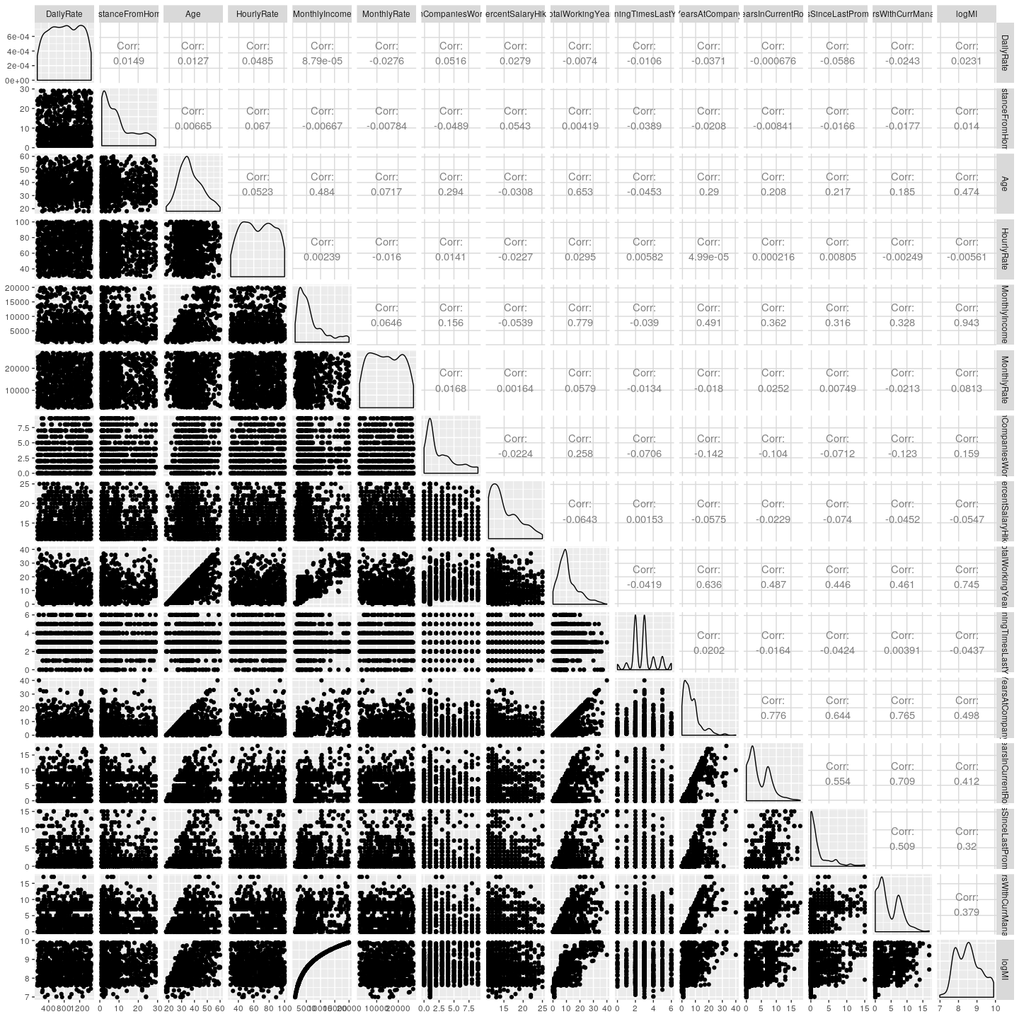
Multivariate Exploration
Scatter plot and correlation matrix gives a board overview of correlations between continuous variables.
MonthlyIncomeappears to be correlated withAgeandTotalWorkingYearsYearsAtCompany,YearsInCurrentRole,YearsSinceLastPromotion,YearsWithCurrManager,TotalWorkingYears, andAgeappear to be correlated.
train %>%
  select(c(features.numeric)) %>%
  ggpairs()
Look at log of MonthlyIncome logMI because MonthlyIncome is right
skewed
train <- train %>% mutate(logMI = log(MonthlyIncome))
train %>%
  select(c(features.numeric, 'logMI')) %>%
  ggpairs()
Close up of MonthlyIncome and highest correlated features
Taking the log of MonthlyIncome does not appear to improve linear correlation.
train %>%
  select(c('logMI','MonthlyIncome','Age','TotalWorkingYears','YearsAtCompany','YearsInCurrentRole',
           'YearsSinceLastPromotion','YearsWithCurrManager')) %>%
  ggpairs()
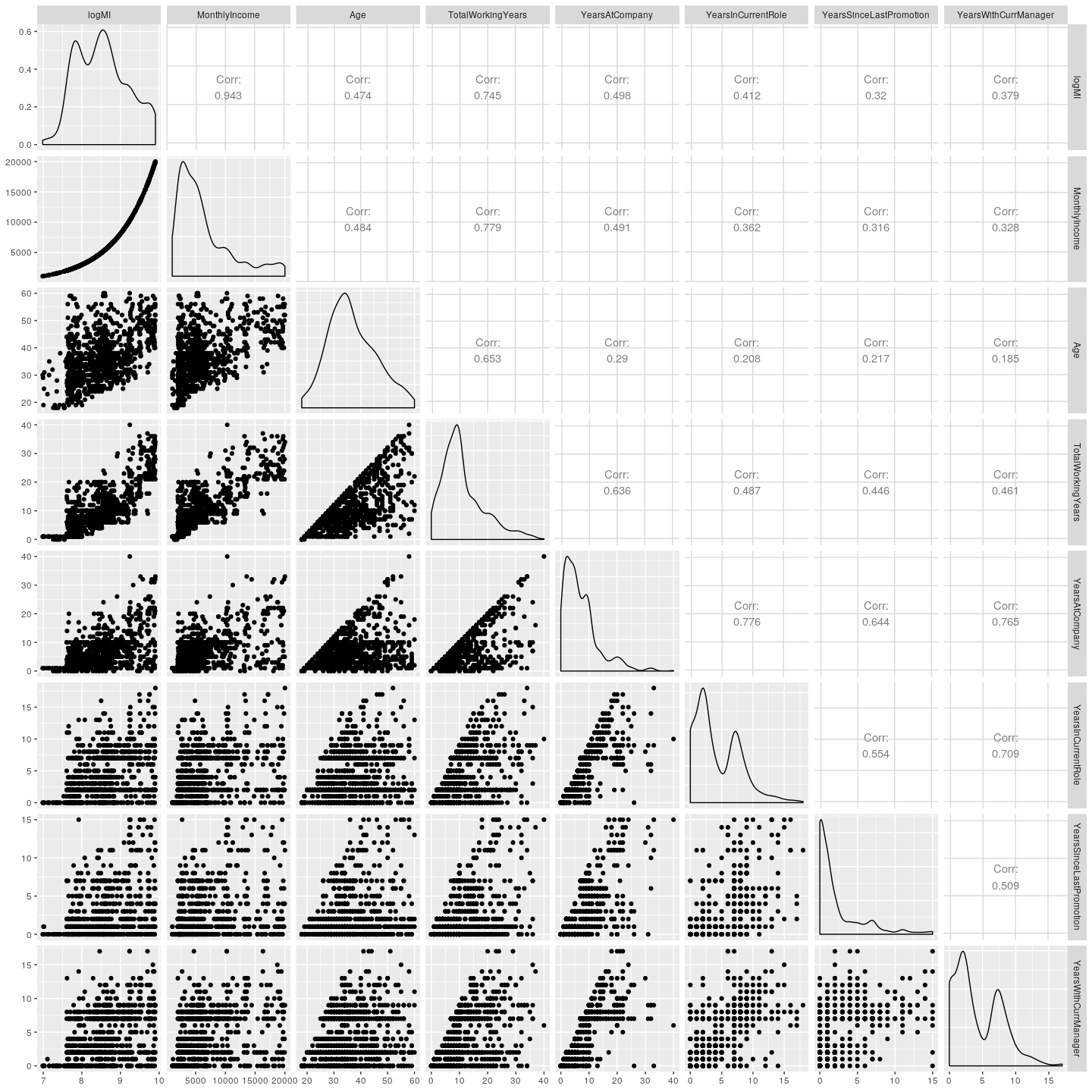
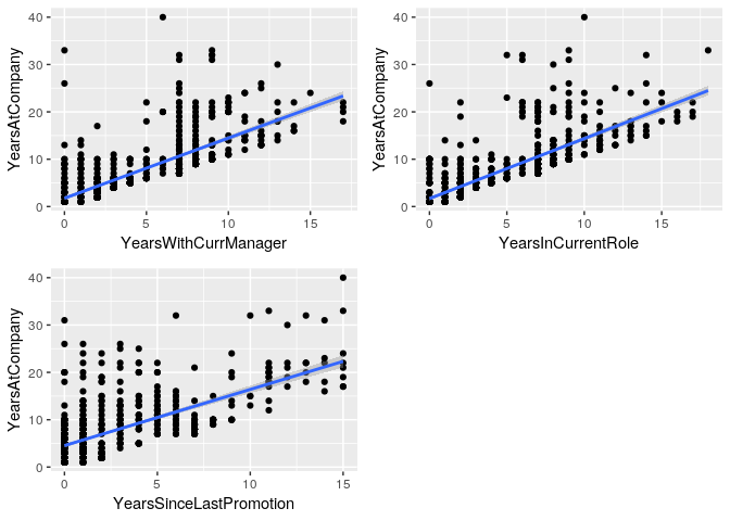
From the plot above, several of the variables appear to be linearly
related: YearsAtCompany vs YearsWithCurrManager,
YearsInCurrentRole and YearsSinceLastPromotion. This could be an
interesting trend in the data.
p1 <- train %>% filter(YearsAtCompany > 0) %>%
  ggplot(aes(x = YearsWithCurrManager, y = YearsAtCompany)) +
  geom_point() + geom_smooth(method = 'lm')
p2 <- train %>% filter(YearsAtCompany > 0) %>%
  ggplot(aes(x = YearsInCurrentRole, y = YearsAtCompany)) +
  geom_point() + geom_smooth(method = 'lm')
p3 <- train %>% filter(YearsAtCompany > 0) %>%
  ggplot(aes(x = YearsSinceLastPromotion, y = YearsAtCompany)) +
  geom_point() + geom_smooth(method = 'lm')
grid.arrange(p1,p2,p3, ncol = 2)
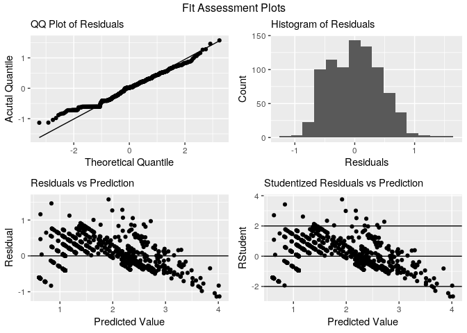
m.YearsAtCompany <- train %>%
  filter(YearsAtCompany > 0) %>%
  lm(log(YearsAtCompany) ~ YearsSinceLastPromotion +  YearsInCurrentRole + YearsWithCurrManager, data = .)

summary(m.YearsAtCompany)
##
## Call:
## lm(formula = log(YearsAtCompany) ~ YearsSinceLastPromotion +
##     YearsInCurrentRole + YearsWithCurrManager, data = .)
##
## Residuals:
##      Min       1Q   Median       3Q      Max
## -1.13397 -0.36114  0.02062  0.30107  1.57553
##
## Coefficients:
##                         Estimate Std. Error t value Pr(>|t|)
## (Intercept)             0.608360   0.024460  24.872  < 2e-16 ***
## YearsSinceLastPromotion 0.022474   0.005623   3.997 6.99e-05 ***
## YearsInCurrentRole      0.108390   0.006035  17.960  < 2e-16 ***
## YearsWithCurrManager    0.115189   0.005946  19.373  < 2e-16 ***
## ---
## Signif. codes:  0 '***' 0.001 '**' 0.01 '*' 0.05 '.' 0.1 ' ' 1
##
## Residual standard error: 0.4311 on 838 degrees of freedom
## Multiple R-squared:  0.767,  Adjusted R-squared:  0.7662
## F-statistic: 919.7 on 3 and 838 DF,  p-value: < 2.2e-16
train %>% filter(YearsAtCompany > 0) %>%basic.fit.plots(., m.YearsAtCompany)
Explanatory - factor Variables
Exploration of the continuous variables.
For investigation of the categrical variables, we will look at variables
correlated to monthly income. Monthly income is correlated with
TotalworkingYears, Age, YearsAtCompany, YearsInCurrentRole, and
YearsWithCurrentManager.
# create a vector of numeric features
features.factor <- c('BusinessTravel', 'Department', 'Education', 'EducationField', 'EmployeeNumber', 'EnvironmentSatisfaction', 'Gender', 'JobInvolvement', 'JobLevel', 'JobRole', 'JobSatisfaction', 'MaritalStatus', 'OverTime', 'PerformanceRating', 'RelationshipSatisfaction', 'StockOptionLevel', 'WorkLifeBalance')

# factor categorical variables
train[, features.factor] <- lapply(train[, features.factor], as.factor)
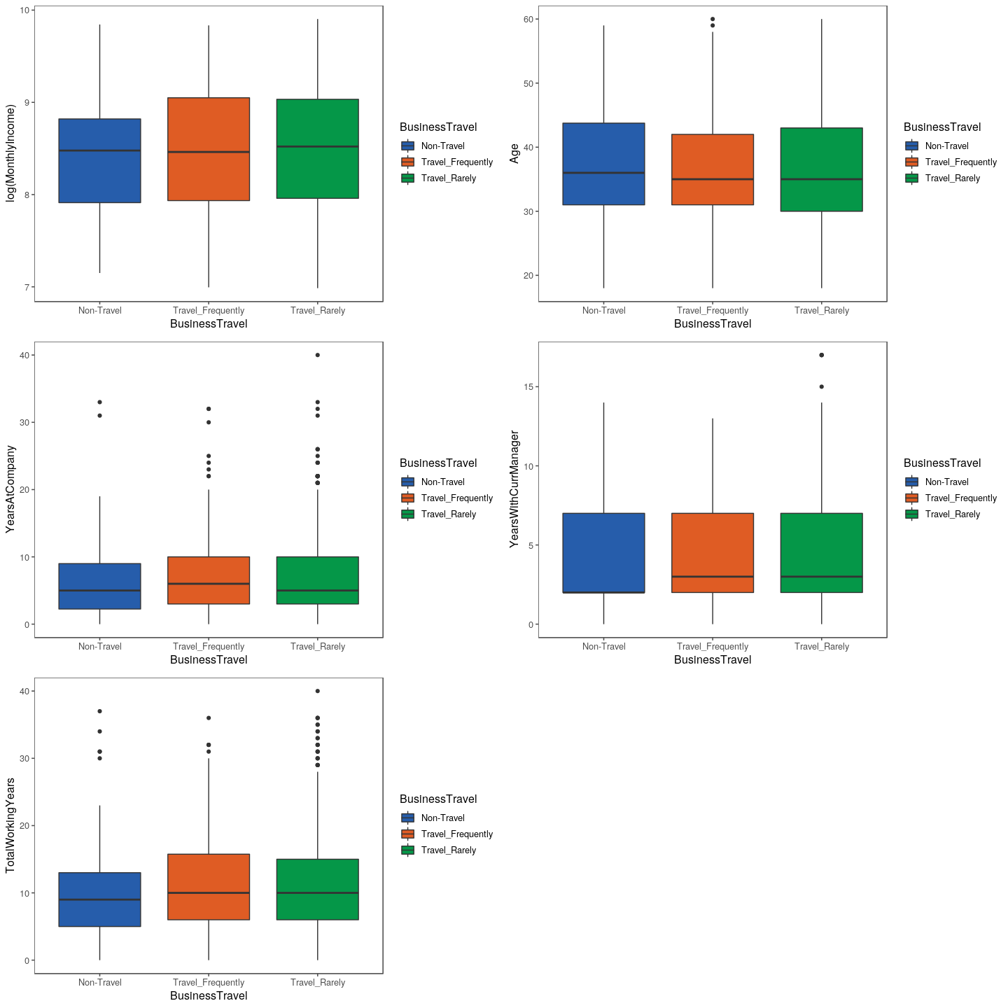
BusinessTravel
btMI <- train %>%
  ggplot(aes(x = BusinessTravel,
             y = log(MonthlyIncome),
             fill = BusinessTravel)) +
  geom_boxplot() +
  scale_fill_few(palette = 'Dark') +
  theme_few()

btAg <- train %>%
  ggplot(aes(x = BusinessTravel,
             y = Age,
             fill = BusinessTravel)) +
  geom_boxplot() +
  scale_fill_few(palette = 'Dark') +
  theme_few()

btYAC <- train %>%
  ggplot(aes(x = BusinessTravel,
             y = YearsAtCompany,
             fill = BusinessTravel)) +
  geom_boxplot() +
  scale_fill_few(palette = 'Dark') +
  theme_few()

btYCM <- train %>%
  ggplot(aes(x = BusinessTravel,
             y = YearsWithCurrManager,
             fill = BusinessTravel)) +
  geom_boxplot() +
  scale_fill_few(palette = 'Dark') +
  theme_few()

btTWY <- train %>%
  ggplot(aes(x = BusinessTravel,
             y = TotalWorkingYears,
             fill = BusinessTravel)) +
  geom_boxplot() +
  scale_fill_few(palette = 'Dark') +
  theme_few()

grid.arrange(btMI, btAg, btYAC, btYCM, btTWY)
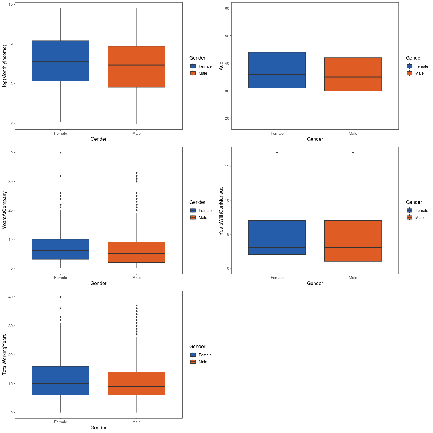
btMI <- train %>%
  ggplot(aes(x = Gender,
             y = log(MonthlyIncome),
             fill = Gender)) +
  geom_boxplot() +
  scale_fill_few(palette = 'Dark') +
  theme_few()

btAg <- train %>%
  ggplot(aes(x = Gender,
             y = Age,
             fill = Gender)) +
  geom_boxplot() +
  scale_fill_few(palette = 'Dark') +
  theme_few()

btYAC <- train %>%
  ggplot(aes(x = Gender,
             y = YearsAtCompany,
             fill = Gender)) +
  geom_boxplot() +
  scale_fill_few(palette = 'Dark') +
  theme_few()

btYCM <- train %>%
  ggplot(aes(x = Gender,
             y = YearsWithCurrManager,
             fill = Gender)) +
  geom_boxplot() +
  scale_fill_few(palette = 'Dark') +
  theme_few()

btTWY <- train %>%
  ggplot(aes(x = Gender,
             y = TotalWorkingYears,
             fill = Gender)) +
  geom_boxplot() +
  scale_fill_few(palette = 'Dark') +
  theme_few()

grid.arrange(btMI, btAg, btYAC, btYCM, btTWY)
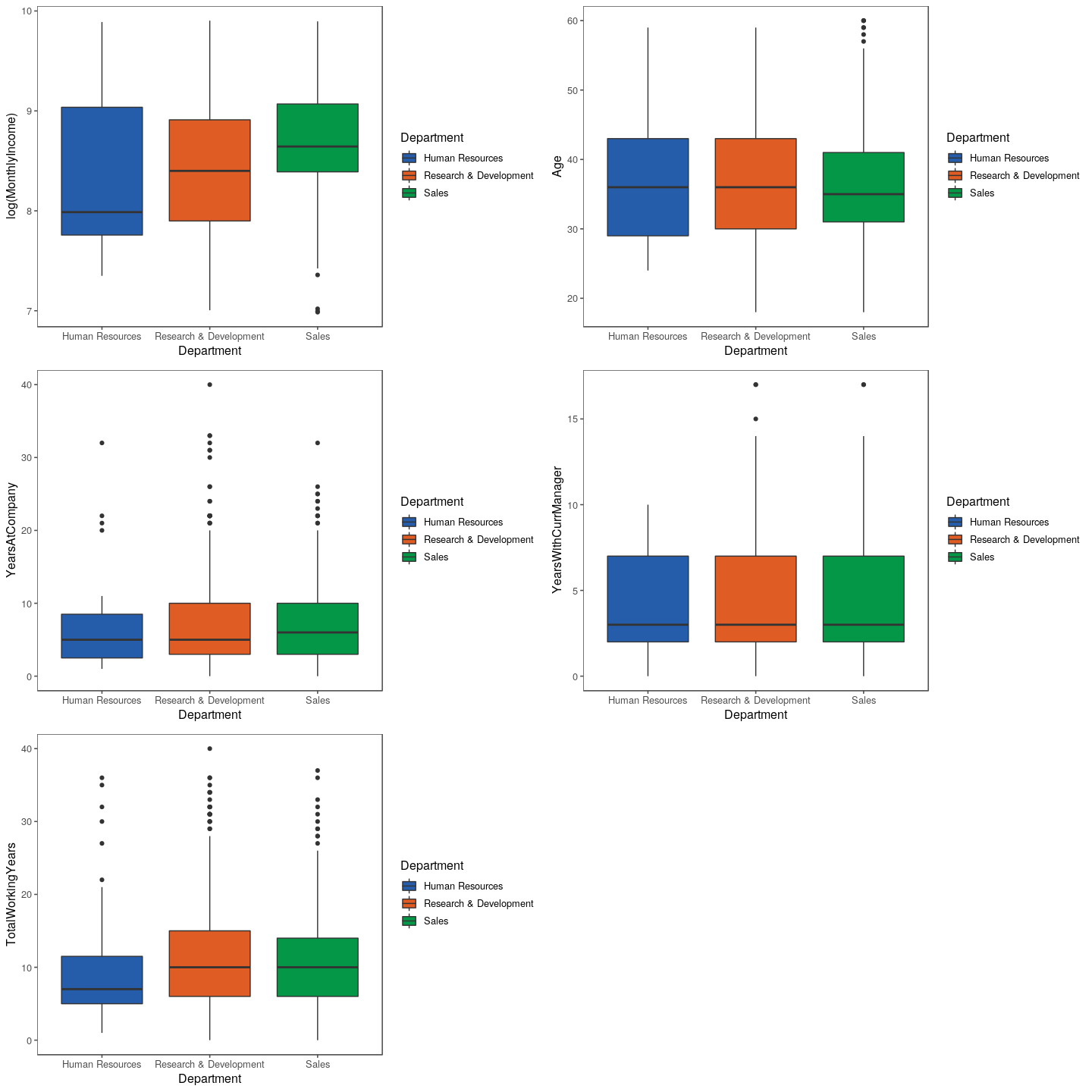
btMI <- train %>%
  ggplot(aes(x = Department,
             y = log(MonthlyIncome),
             fill = Department)) +
  geom_boxplot() +
  scale_fill_few(palette = 'Dark') +
  theme_few()

btAg <- train %>%
  ggplot(aes(x = Department,
             y = Age,
             fill = Department)) +
  geom_boxplot() +
  scale_fill_few(palette = 'Dark') +
  theme_few()

btYAC <- train %>%
  ggplot(aes(x = Department,
             y = YearsAtCompany,
             fill = Department)) +
  geom_boxplot() +
  scale_fill_few(palette = 'Dark') +
  theme_few()

btYCM <- train %>%
  ggplot(aes(x = Department,
             y = YearsWithCurrManager,
             fill = Department)) +
  geom_boxplot() +
  scale_fill_few(palette = 'Dark') +
  theme_few()

btTWY <- train %>%
  ggplot(aes(x = Department,
             y = TotalWorkingYears,
             fill = Department)) +
  geom_boxplot() +
  scale_fill_few(palette = 'Dark') +
  theme_few()

grid.arrange(btMI, btAg, btYAC, btYCM, btTWY)
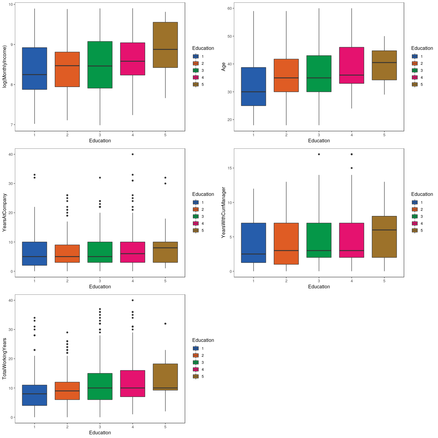
btMI <- train %>%
  ggplot(aes(x = Education,
             y = log(MonthlyIncome),
             fill = Education)) +
  geom_boxplot() +
  scale_fill_few(palette = 'Dark') +
  theme_few()

btAg <- train %>%
  ggplot(aes(x = Education,
             y = Age,
             fill = Education)) +
  geom_boxplot() +
  scale_fill_few(palette = 'Dark') +
  theme_few()

btYAC <- train %>%
  ggplot(aes(x = Education,
             y = YearsAtCompany,
             fill = Education)) +
  geom_boxplot() +
  scale_fill_few(palette = 'Dark') +
  theme_few()

btYCM <- train %>%
  ggplot(aes(x = Education,
             y = YearsWithCurrManager,
             fill = Education)) +
  geom_boxplot() +
  scale_fill_few(palette = 'Dark') +
  theme_few()

btTWY <- train %>%
  ggplot(aes(x = Education,
             y = TotalWorkingYears,
             fill = Education)) +
  geom_boxplot() +
  scale_fill_few(palette = 'Dark') +
  theme_few()

grid.arrange(btMI, btAg, btYAC, btYCM, btTWY)
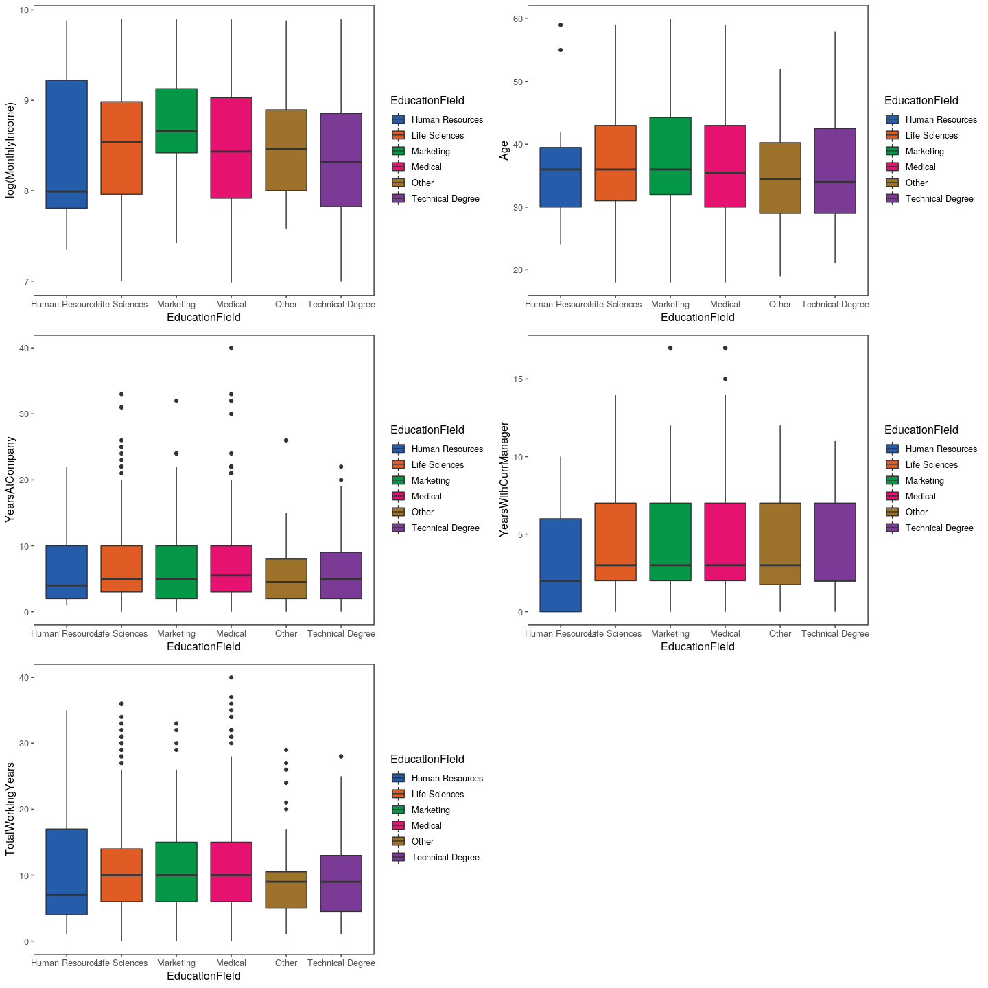
btMI <- train %>%
  ggplot(aes(x = EducationField,
             y = log(MonthlyIncome),
             fill = EducationField)) +
  geom_boxplot() +
  scale_fill_few(palette = 'Dark') +
  theme_few()

btAg <- train %>%
  ggplot(aes(x = EducationField,
             y = Age,
             fill = EducationField)) +
  geom_boxplot() +
  scale_fill_few(palette = 'Dark') +
  theme_few()

btYAC <- train %>%
  ggplot(aes(x = EducationField,
             y = YearsAtCompany,
             fill = EducationField)) +
  geom_boxplot() +
  scale_fill_few(palette = 'Dark') +
  theme_few()

btYCM <- train %>%
  ggplot(aes(x = EducationField,
             y = YearsWithCurrManager,
             fill = EducationField)) +
  geom_boxplot() +
  scale_fill_few(palette = 'Dark') +
  theme_few()

btTWY <- train %>%
  ggplot(aes(x = EducationField,
             y = TotalWorkingYears,
             fill = EducationField)) +
  geom_boxplot() +
  scale_fill_few(palette = 'Dark') +
  theme_few()

grid.arrange(btMI, btAg, btYAC, btYCM, btTWY)
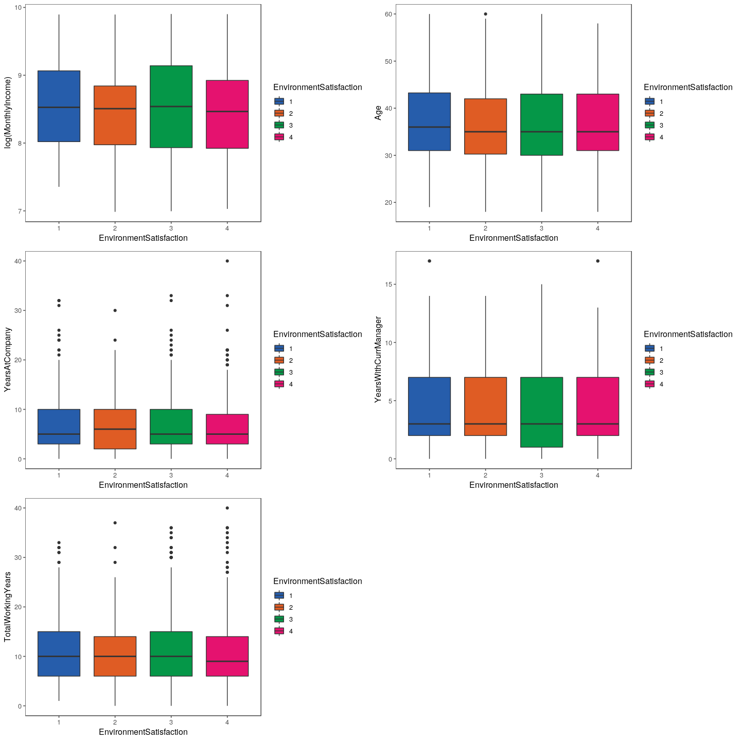
btMI <- train %>%
  ggplot(aes(x = EnvironmentSatisfaction,
             y = log(MonthlyIncome),
             fill = EnvironmentSatisfaction)) +
  geom_boxplot() +
  scale_fill_few(palette = 'Dark') +
  theme_few()

btAg <- train %>%
  ggplot(aes(x = EnvironmentSatisfaction,
             y = Age,
             fill = EnvironmentSatisfaction)) +
  geom_boxplot() +
  scale_fill_few(palette = 'Dark') +
  theme_few()

btYAC <- train %>%
  ggplot(aes(x = EnvironmentSatisfaction,
             y = YearsAtCompany,
             fill = EnvironmentSatisfaction)) +
  geom_boxplot() +
  scale_fill_few(palette = 'Dark') +
  theme_few()

btYCM <- train %>%
  ggplot(aes(x = EnvironmentSatisfaction,
             y = YearsWithCurrManager,
             fill = EnvironmentSatisfaction)) +
  geom_boxplot() +
  scale_fill_few(palette = 'Dark') +
  theme_few()

btTWY <- train %>%
  ggplot(aes(x = EnvironmentSatisfaction,
             y = TotalWorkingYears,
             fill = EnvironmentSatisfaction)) +
  geom_boxplot() +
  scale_fill_few(palette = 'Dark') +
  theme_few()

grid.arrange(btMI, btAg, btYAC, btYCM, btTWY)
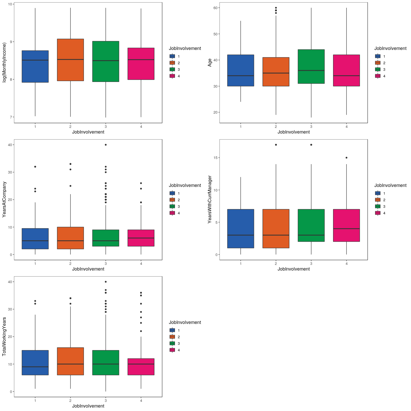
btMI <- train %>%
  ggplot(aes(x = JobInvolvement,
             y = log(MonthlyIncome),
             fill = JobInvolvement)) +
  geom_boxplot() +
  scale_fill_few(palette = 'Dark') +
  theme_few()

btAg <- train %>%
  ggplot(aes(x = JobInvolvement,
             y = Age,
             fill = JobInvolvement)) +
  geom_boxplot() +
  scale_fill_few(palette = 'Dark') +
  theme_few()

btYAC <- train %>%
  ggplot(aes(x = JobInvolvement,
             y = YearsAtCompany,
             fill = JobInvolvement)) +
  geom_boxplot() +
  scale_fill_few(palette = 'Dark') +
  theme_few()

btYCM <- train %>%
  ggplot(aes(x = JobInvolvement,
             y = YearsWithCurrManager,
             fill = JobInvolvement)) +
  geom_boxplot() +
  scale_fill_few(palette = 'Dark') +
  theme_few()

btTWY <- train %>%
  ggplot(aes(x = JobInvolvement,
             y = TotalWorkingYears,
             fill = JobInvolvement)) +
  geom_boxplot() +
  scale_fill_few(palette = 'Dark') +
  theme_few()

grid.arrange(btMI, btAg, btYAC, btYCM, btTWY)
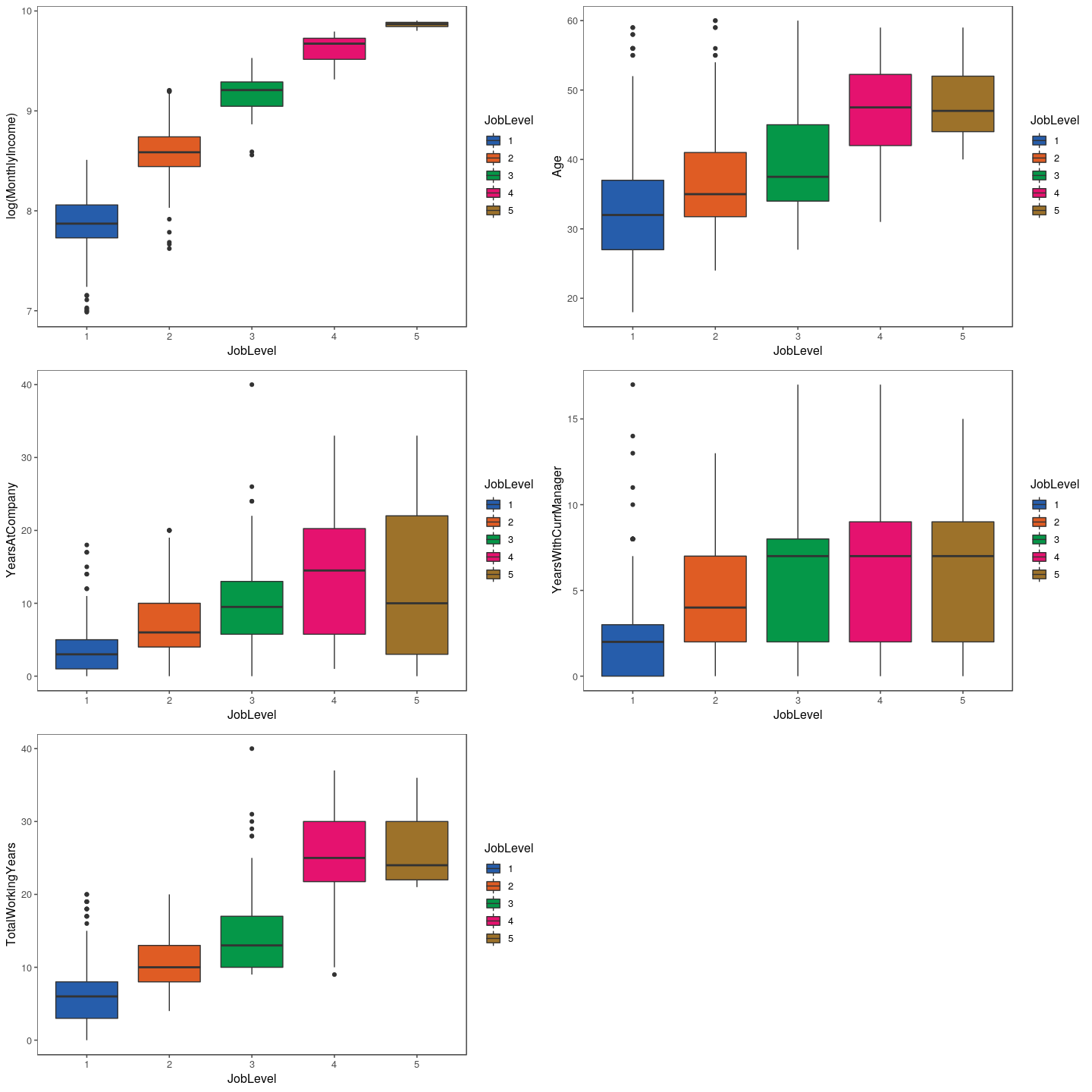
btMI <- train %>%
  ggplot(aes(x = JobLevel,
             y = log(MonthlyIncome),
             fill = JobLevel)) +
  geom_boxplot() +
  scale_fill_few(palette = 'Dark') +
  theme_few()

btAg <- train %>%
  ggplot(aes(x = JobLevel,
             y = Age,
             fill = JobLevel)) +
  geom_boxplot() +
  scale_fill_few(palette = 'Dark') +
  theme_few()

btYAC <- train %>%
  ggplot(aes(x = JobLevel,
             y = YearsAtCompany,
             fill = JobLevel)) +
  geom_boxplot() +
  scale_fill_few(palette = 'Dark') +
  theme_few()

btYCM <- train %>%
  ggplot(aes(x = JobLevel,
             y = YearsWithCurrManager,
             fill = JobLevel)) +
  geom_boxplot() +
  scale_fill_few(palette = 'Dark') +
  theme_few()

btTWY <- train %>%
  ggplot(aes(x = JobLevel,
             y = TotalWorkingYears,
             fill = JobLevel)) +
  geom_boxplot() +
  scale_fill_few(palette = 'Dark') +
  theme_few()

grid.arrange(btMI, btAg, btYAC, btYCM, btTWY)
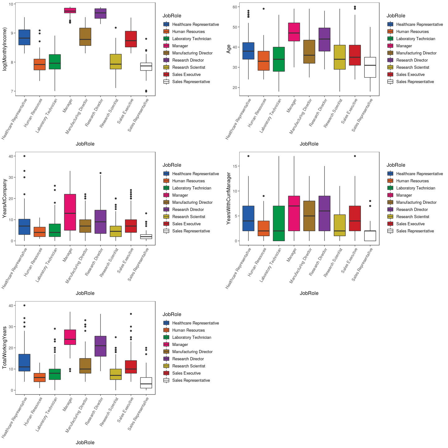
btMI <- train %>%
  ggplot(aes(x = JobRole,
             y = log(MonthlyIncome),
             fill = JobRole)) +
  geom_boxplot() +
  scale_fill_few(palette = 'Dark') +
  theme_few() +
  theme(axis.text.x = element_text(angle = 60, hjust = 1))

btAg <- train %>%
  ggplot(aes(x = JobRole,
             y = Age,
             fill = JobRole)) +
  geom_boxplot() +
  scale_fill_few(palette = 'Dark') +
  theme_few() +
  theme(axis.text.x = element_text(angle = 60, hjust = 1))

btYAC <- train %>%
  ggplot(aes(x = JobRole,
             y = YearsAtCompany,
             fill = JobRole)) +
  geom_boxplot() +
  scale_fill_few(palette = 'Dark') +
  theme_few() +
  theme(axis.text.x = element_text(angle = 60, hjust = 1))

btYCM <- train %>%
  ggplot(aes(x = JobRole,
             y = YearsWithCurrManager,
             fill = JobRole)) +
  geom_boxplot() +
  scale_fill_few(palette = 'Dark') +
  theme_few() +
  theme(axis.text.x = element_text(angle = 60, hjust = 1))

btTWY <- train %>%
  ggplot(aes(x = JobRole,
             y = TotalWorkingYears,
             fill = JobRole)) +
  geom_boxplot() +
  scale_fill_few(palette = 'Dark') +
  theme_few() +
  theme(axis.text.x = element_text(angle = 60, hjust = 1))

grid.arrange(btMI, btAg, btYAC, btYCM, btTWY)
## Warning in check_pal_n(n, max_n): This palette can handle a maximum of 8
## values.You have supplied 9.

## Warning in check_pal_n(n, max_n): This palette can handle a maximum of 8
## values.You have supplied 9.

## Warning in check_pal_n(n, max_n): This palette can handle a maximum of 8
## values.You have supplied 9.

## Warning in check_pal_n(n, max_n): This palette can handle a maximum of 8
## values.You have supplied 9.

## Warning in check_pal_n(n, max_n): This palette can handle a maximum of 8
## values.You have supplied 9.
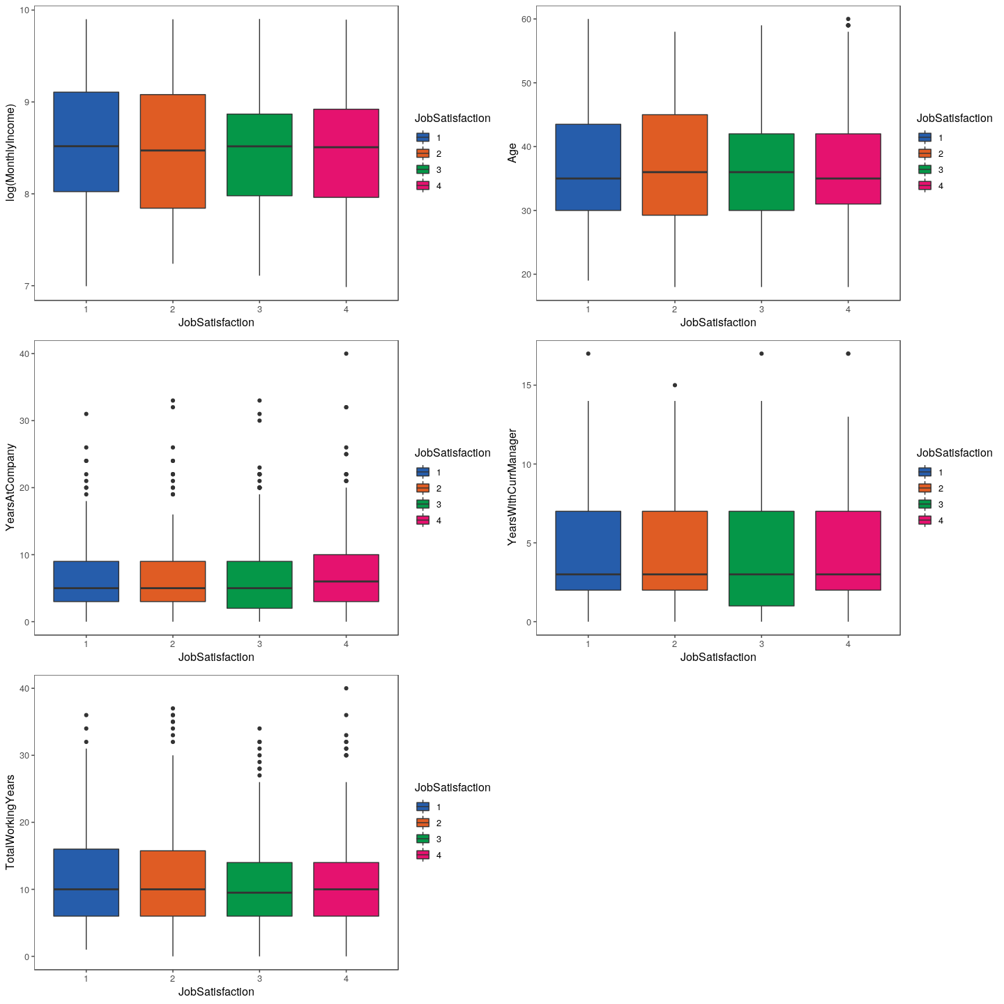
btMI <- train %>%
  ggplot(aes(x = JobSatisfaction,
             y = log(MonthlyIncome),
             fill = JobSatisfaction)) +
  geom_boxplot() +
  scale_fill_few(palette = 'Dark') +
  theme_few()

btAg <- train %>%
  ggplot(aes(x = JobSatisfaction,
             y = Age,
             fill = JobSatisfaction)) +
  geom_boxplot() +
  scale_fill_few(palette = 'Dark') +
  theme_few()

btYAC <- train %>%
  ggplot(aes(x = JobSatisfaction,
             y = YearsAtCompany,
             fill = JobSatisfaction)) +
  geom_boxplot() +
  scale_fill_few(palette = 'Dark') +
  theme_few()

btYCM <- train %>%
  ggplot(aes(x = JobSatisfaction,
             y = YearsWithCurrManager,
             fill = JobSatisfaction)) +
  geom_boxplot() +
  scale_fill_few(palette = 'Dark') +
  theme_few()

btTWY <- train %>%
  ggplot(aes(x = JobSatisfaction,
             y = TotalWorkingYears,
             fill = JobSatisfaction)) +
  geom_boxplot() +
  scale_fill_few(palette = 'Dark') +
  theme_few()

grid.arrange(btMI, btAg, btYAC, btYCM, btTWY)
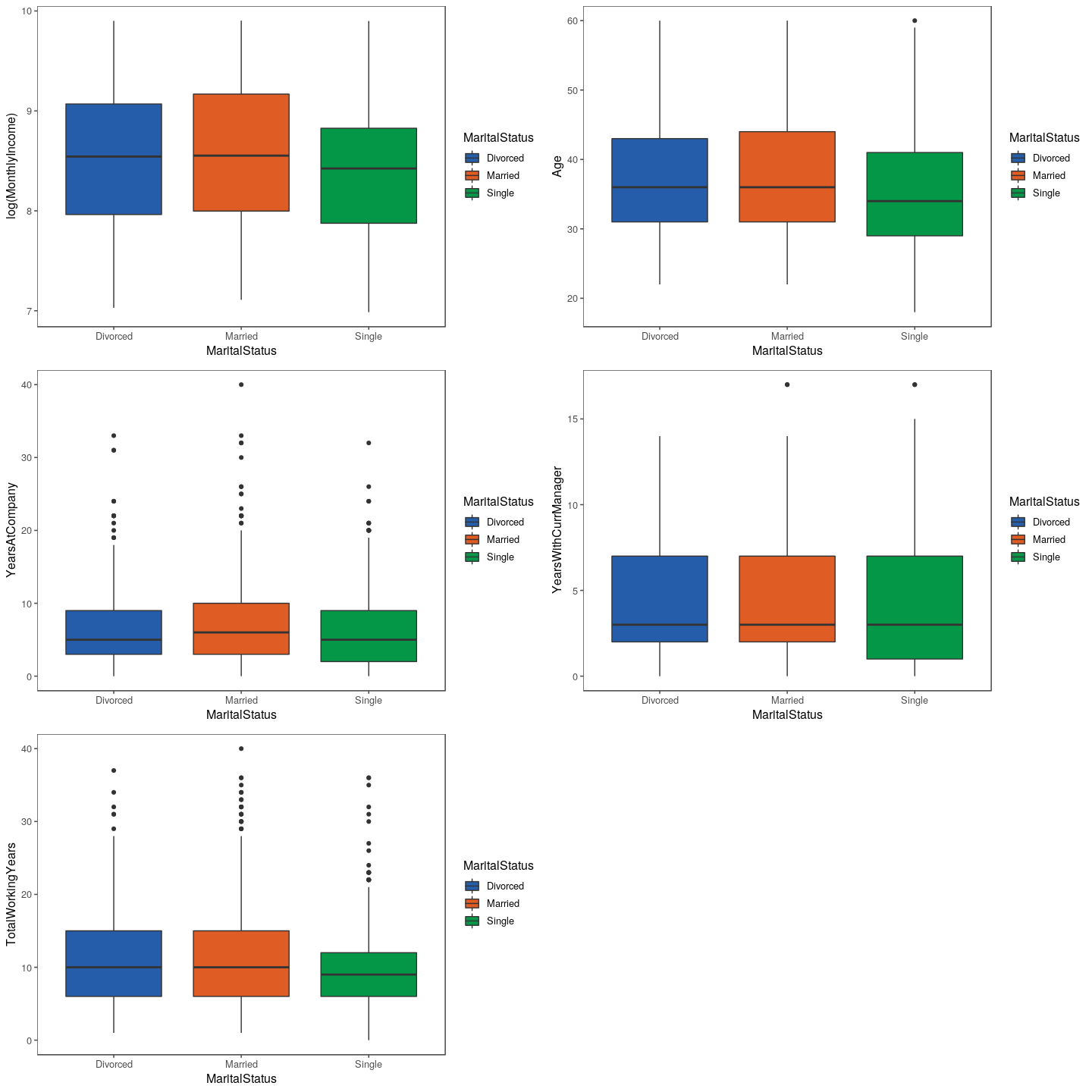
btMI <- train %>%
  ggplot(aes(x = MaritalStatus,
             y = log(MonthlyIncome),
             fill = MaritalStatus)) +
  geom_boxplot() +
  scale_fill_few(palette = 'Dark') +
  theme_few()

btAg <- train %>%
  ggplot(aes(x = MaritalStatus,
             y = Age,
             fill = MaritalStatus)) +
  geom_boxplot() +
  scale_fill_few(palette = 'Dark') +
  theme_few()

btYAC <- train %>%
  ggplot(aes(x = MaritalStatus,
             y = YearsAtCompany,
             fill = MaritalStatus)) +
  geom_boxplot() +
  scale_fill_few(palette = 'Dark') +
  theme_few()

btYCM <- train %>%
  ggplot(aes(x = MaritalStatus,
             y = YearsWithCurrManager,
             fill = MaritalStatus)) +
  geom_boxplot() +
  scale_fill_few(palette = 'Dark') +
  theme_few()

btTWY <- train %>%
  ggplot(aes(x = MaritalStatus,
             y = TotalWorkingYears,
             fill = MaritalStatus)) +
  geom_boxplot() +
  scale_fill_few(palette = 'Dark') +
  theme_few()

grid.arrange(btMI, btAg, btYAC, btYCM, btTWY)
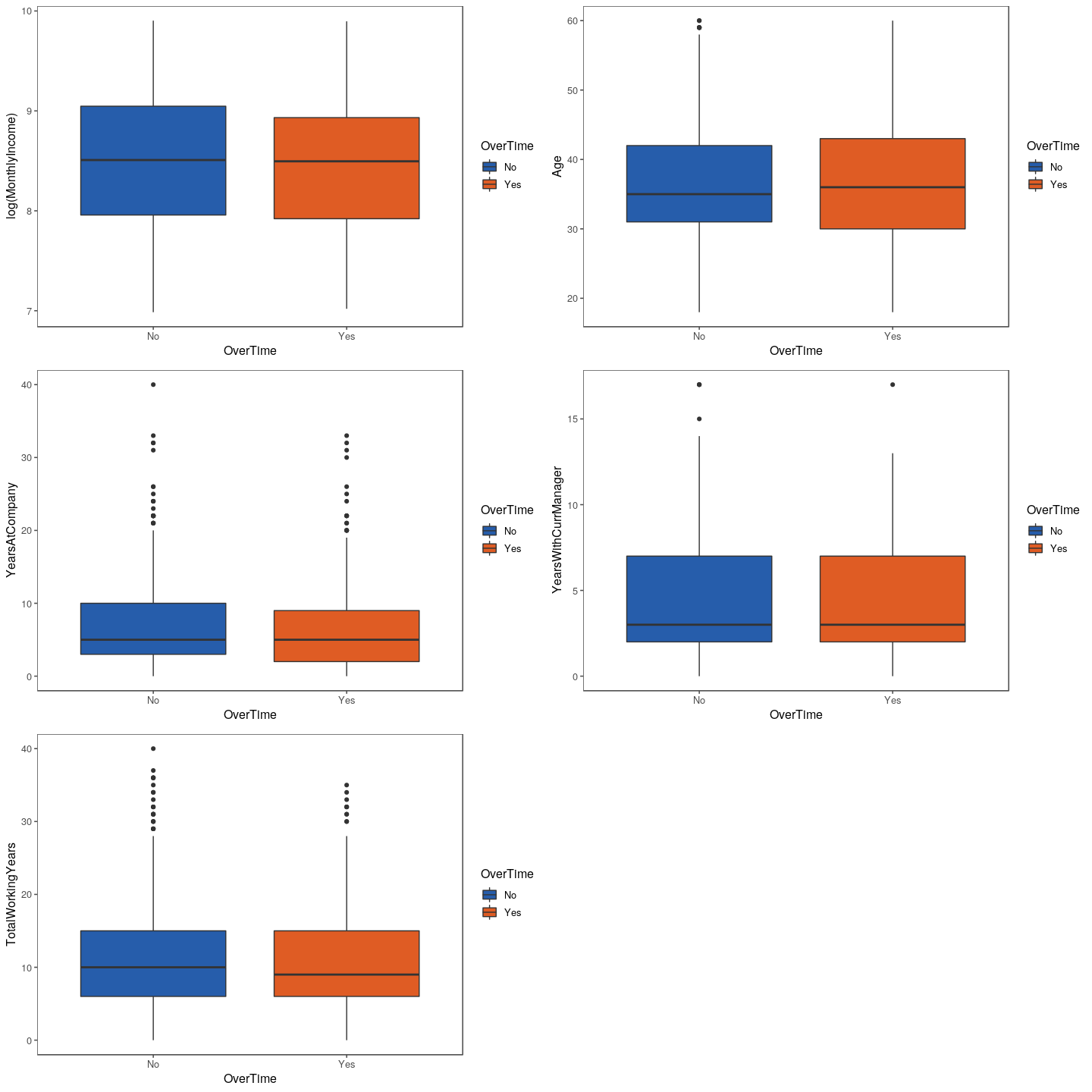
btMI <- train %>%
  ggplot(aes(x = OverTime,
             y = log(MonthlyIncome),
             fill = OverTime)) +
  geom_boxplot() +
  scale_fill_few(palette = 'Dark') +
  theme_few()

btAg <- train %>%
  ggplot(aes(x = OverTime,
             y = Age,
             fill = OverTime)) +
  geom_boxplot() +
  scale_fill_few(palette = 'Dark') +
  theme_few()

btYAC <- train %>%
  ggplot(aes(x = OverTime,
             y = YearsAtCompany,
             fill = OverTime)) +
  geom_boxplot() +
  scale_fill_few(palette = 'Dark') +
  theme_few()

btYCM <- train %>%
  ggplot(aes(x = OverTime,
             y = YearsWithCurrManager,
             fill = OverTime)) +
  geom_boxplot() +
  scale_fill_few(palette = 'Dark') +
  theme_few()

btTWY <- train %>%
  ggplot(aes(x = OverTime,
             y = TotalWorkingYears,
             fill = OverTime)) +
  geom_boxplot() +
  scale_fill_few(palette = 'Dark') +
  theme_few()

grid.arrange(btMI, btAg, btYAC, btYCM, btTWY)
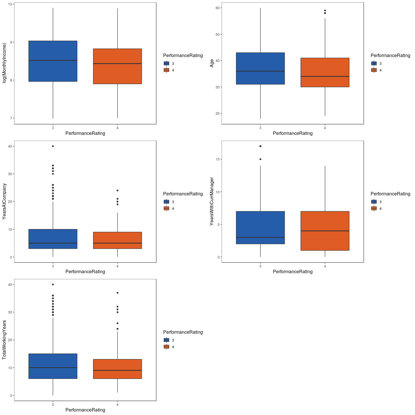
btMI <- train %>%
  ggplot(aes(x = PerformanceRating,
             y = log(MonthlyIncome),
             fill = PerformanceRating)) +
  geom_boxplot() +
  scale_fill_few(palette = 'Dark') +
  theme_few()

btAg <- train %>%
  ggplot(aes(x = PerformanceRating,
             y = Age,
             fill = PerformanceRating)) +
  geom_boxplot() +
  scale_fill_few(palette = 'Dark') +
  theme_few()

btYAC <- train %>%
  ggplot(aes(x = PerformanceRating,
             y = YearsAtCompany,
             fill = PerformanceRating)) +
  geom_boxplot() +
  scale_fill_few(palette = 'Dark') +
  theme_few()

btYCM <- train %>%
  ggplot(aes(x = PerformanceRating,
             y = YearsWithCurrManager,
             fill = PerformanceRating)) +
  geom_boxplot() +
  scale_fill_few(palette = 'Dark') +
  theme_few()

btTWY <- train %>%
  ggplot(aes(x = PerformanceRating,
             y = TotalWorkingYears,
             fill = PerformanceRating)) +
  geom_boxplot() +
  scale_fill_few(palette = 'Dark') +
  theme_few()

grid.arrange(btMI, btAg, btYAC, btYCM, btTWY)
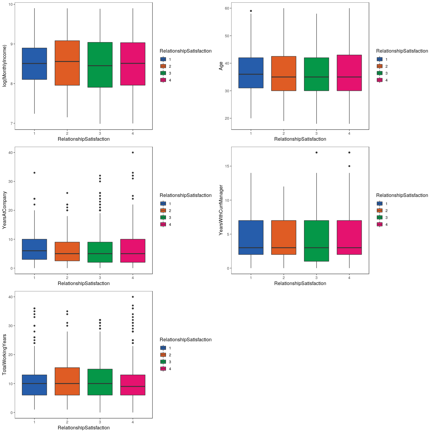
btMI <- train %>%
  ggplot(aes(x = RelationshipSatisfaction,
             y = log(MonthlyIncome),
             fill = RelationshipSatisfaction)) +
  geom_boxplot() +
  scale_fill_few(palette = 'Dark') +
  theme_few()

btAg <- train %>%
  ggplot(aes(x = RelationshipSatisfaction,
             y = Age,
             fill = RelationshipSatisfaction)) +
  geom_boxplot() +
  scale_fill_few(palette = 'Dark') +
  theme_few()

btYAC <- train %>%
  ggplot(aes(x = RelationshipSatisfaction,
             y = YearsAtCompany,
             fill = RelationshipSatisfaction)) +
  geom_boxplot() +
  scale_fill_few(palette = 'Dark') +
  theme_few()

btYCM <- train %>%
  ggplot(aes(x = RelationshipSatisfaction,
             y = YearsWithCurrManager,
             fill = RelationshipSatisfaction)) +
  geom_boxplot() +
  scale_fill_few(palette = 'Dark') +
  theme_few()

btTWY <- train %>%
  ggplot(aes(x = RelationshipSatisfaction,
             y = TotalWorkingYears,
             fill = RelationshipSatisfaction)) +
  geom_boxplot() +
  scale_fill_few(palette = 'Dark') +
  theme_few()

grid.arrange(btMI, btAg, btYAC, btYCM, btTWY)
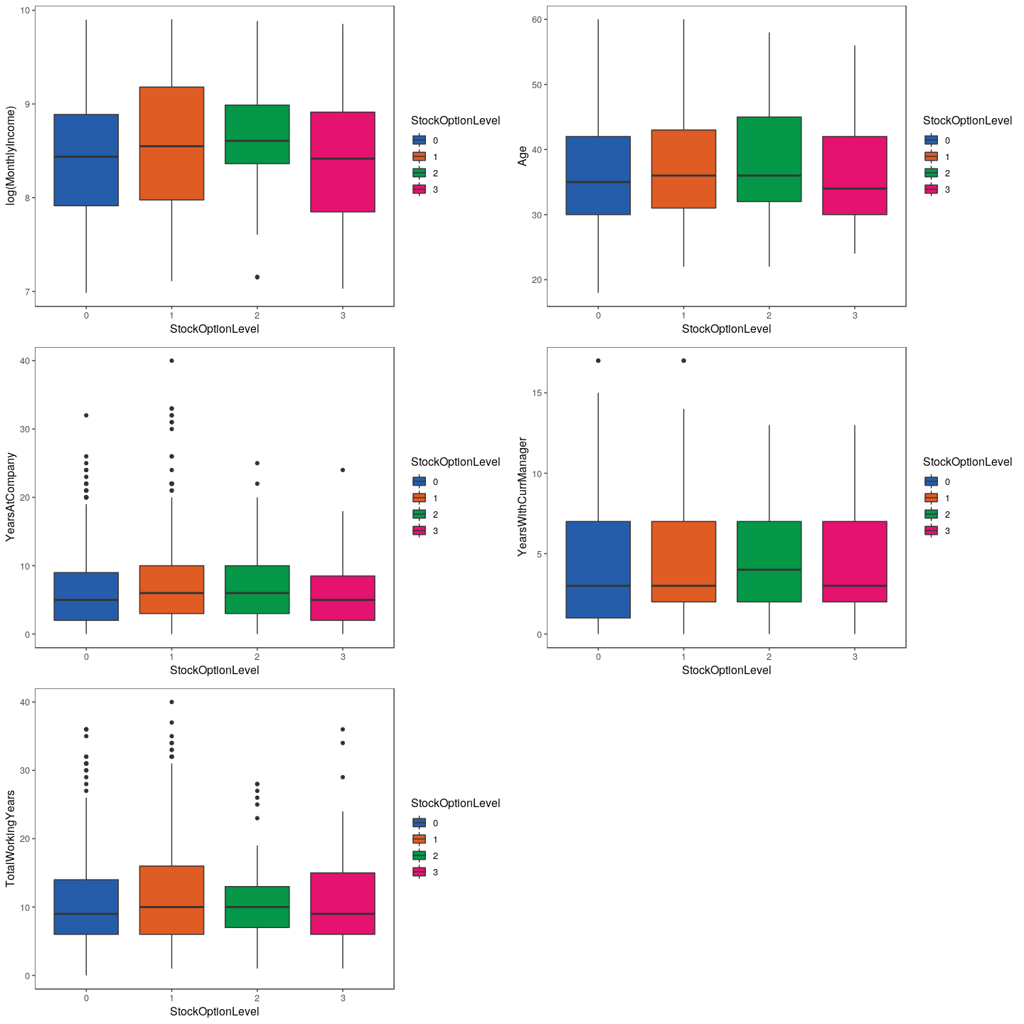
btMI <- train %>%
  ggplot(aes(x = StockOptionLevel,
             y = log(MonthlyIncome),
             fill = StockOptionLevel)) +
  geom_boxplot() +
  scale_fill_few(palette = 'Dark') +
  theme_few()

btAg <- train %>%
  ggplot(aes(x = StockOptionLevel,
             y = Age,
             fill = StockOptionLevel)) +
  geom_boxplot() +
  scale_fill_few(palette = 'Dark') +
  theme_few()

btYAC <- train %>%
  ggplot(aes(x = StockOptionLevel,
             y = YearsAtCompany,
             fill = StockOptionLevel)) +
  geom_boxplot() +
  scale_fill_few(palette = 'Dark') +
  theme_few()

btYCM <- train %>%
  ggplot(aes(x = StockOptionLevel,
             y = YearsWithCurrManager,
             fill = StockOptionLevel)) +
  geom_boxplot() +
  scale_fill_few(palette = 'Dark') +
  theme_few()

btTWY <- train %>%
  ggplot(aes(x = StockOptionLevel,
             y = TotalWorkingYears,
             fill = StockOptionLevel)) +
  geom_boxplot() +
  scale_fill_few(palette = 'Dark') +
  theme_few()

grid.arrange(btMI, btAg, btYAC, btYCM, btTWY)
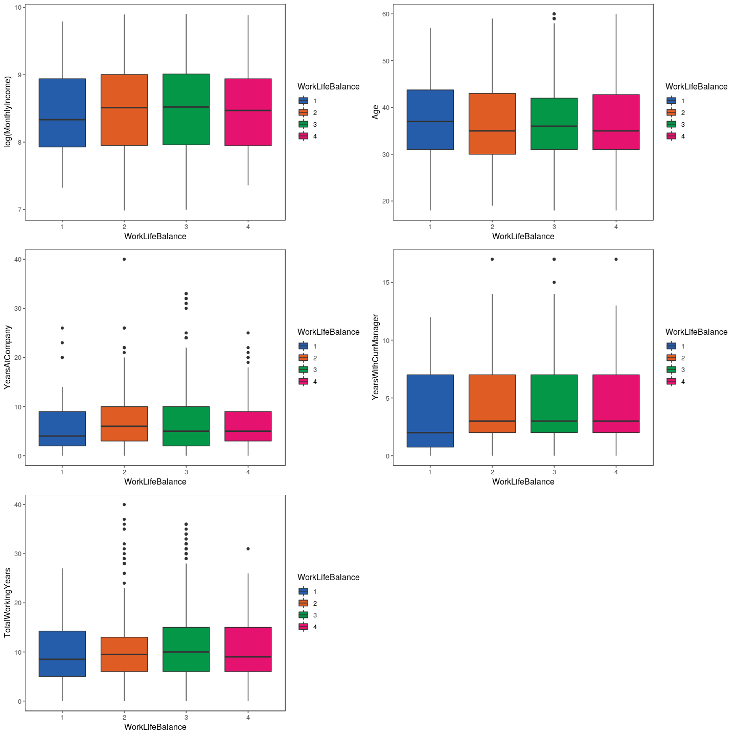
btMI <- train %>%
  ggplot(aes(x = WorkLifeBalance,
             y = log(MonthlyIncome),
             fill = WorkLifeBalance)) +
  geom_boxplot() +
  scale_fill_few(palette = 'Dark') +
  theme_few()

btAg <- train %>%
  ggplot(aes(x = WorkLifeBalance,
             y = Age,
             fill = WorkLifeBalance)) +
  geom_boxplot() +
  scale_fill_few(palette = 'Dark') +
  theme_few()

btYAC <- train %>%
  ggplot(aes(x = WorkLifeBalance,
             y = YearsAtCompany,
             fill = WorkLifeBalance)) +
  geom_boxplot() +
  scale_fill_few(palette = 'Dark') +
  theme_few()

btYCM <- train %>%
  ggplot(aes(x = WorkLifeBalance,
             y = YearsWithCurrManager,
             fill = WorkLifeBalance)) +
  geom_boxplot() +
  scale_fill_few(palette = 'Dark') +
  theme_few()

btTWY <- train %>%
  ggplot(aes(x = WorkLifeBalance,
             y = TotalWorkingYears,
             fill = WorkLifeBalance)) +
  geom_boxplot() +
  scale_fill_few(palette = 'Dark') +
  theme_few()

grid.arrange(btMI, btAg, btYAC, btYCM, btTWY)
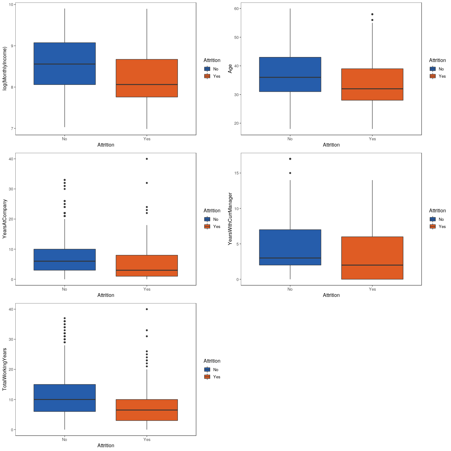
btMI <- train %>%
  ggplot(aes(x = Attrition,
             y = log(MonthlyIncome),
             fill = Attrition)) +
  geom_boxplot() +
  scale_fill_few(palette = 'Dark') +
  theme_few()

btAg <- train %>%
  ggplot(aes(x = Attrition,
             y = Age,
             fill = Attrition)) +
  geom_boxplot() +
  scale_fill_few(palette = 'Dark') +
  theme_few()

btYAC <- train %>%
  ggplot(aes(x = Attrition,
             y = YearsAtCompany,
             fill = Attrition)) +
  geom_boxplot() +
  scale_fill_few(palette = 'Dark') +
  theme_few()

btYCM <- train %>%
  ggplot(aes(x = Attrition,
             y = YearsWithCurrManager,
             fill = Attrition)) +
  geom_boxplot() +
  scale_fill_few(palette = 'Dark') +
  theme_few()

btTWY <- train %>%
  ggplot(aes(x = Attrition,
             y = TotalWorkingYears,
             fill = Attrition)) +
  geom_boxplot() +
  scale_fill_few(palette = 'Dark') +
  theme_few()

grid.arrange(btMI, btAg, btYAC, btYCM, btTWY)
All Numeric Features vs Attrition
features.numeric
##  [1] "DailyRate"               "DistanceFromHome"
##  [3] "Age"                     "HourlyRate"
##  [5] "MonthlyIncome"           "MonthlyRate"
##  [7] "NumCompaniesWorked"      "PercentSalaryHike"
##  [9] "TotalWorkingYears"       "TrainingTimesLastYear"
## [11] "YearsAtCompany"          "YearsInCurrentRole"
## [13] "YearsSinceLastPromotion" "YearsWithCurrManager"
train %>%
  ggplot(aes(x = DailyRate)) +
  geom_histogram(bins = 15) +
  facet_wrap( ~ Attrition, scales = 'free') +
  scale_fill_few(palette = 'Dark') +
  theme_few()
train %>%
  ggplot(aes(x = DistanceFromHome)) +
  geom_histogram(bins = 15) +
  facet_wrap( ~ Attrition, scales = 'free') +
  scale_fill_few(palette = 'Dark') +
  theme_few()
train %>%
  ggplot(aes(x = Age)) +
  geom_histogram(bins = 15) +
  facet_wrap( ~ Attrition, scales = 'free') +
  scale_fill_few(palette = 'Dark') +
  theme_few()
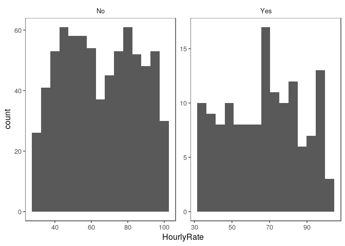
train %>%
  ggplot(aes(x = HourlyRate)) +
  geom_histogram(bins = 15) +
  facet_wrap( ~ Attrition, scales = 'free') +
  scale_fill_few(palette = 'Dark') +
  theme_few()
train %>%
  ggplot(aes(x = MonthlyIncome)) +
  geom_histogram(bins = 15) +
  facet_wrap( ~ Attrition, scales = 'free') +
  scale_fill_few(palette = 'Dark') +
  theme_few()
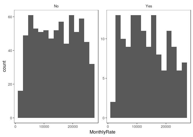
train %>%
  ggplot(aes(x = MonthlyRate)) +
  geom_histogram(bins = 15) +
  facet_wrap( ~ Attrition, scales = 'free') +
  scale_fill_few(palette = 'Dark') +
  theme_few()
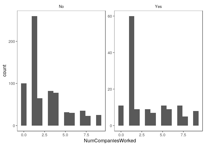
train %>%
  ggplot(aes(x = NumCompaniesWorked)) +
  geom_histogram(bins = 15) +
  facet_wrap( ~ Attrition, scales = 'free') +
  scale_fill_few(palette = 'Dark') +
  theme_few()
train %>%
  ggplot(aes(x = PercentSalaryHike)) +
  geom_histogram(bins = 15) +
  facet_wrap( ~ Attrition, scales = 'free') +
  scale_fill_few(palette = 'Dark') +
  theme_few()
train %>%
  ggplot(aes(x = TotalWorkingYears)) +
  geom_histogram(bins = 15) +
  facet_wrap( ~ Attrition, scales = 'free') +
  scale_fill_few(palette = 'Dark') +
  theme_few()
train %>%
  ggplot(aes(x = TrainingTimesLastYear)) +
  geom_histogram(bins = 15) +
  facet_wrap( ~ Attrition, scales = 'free') +
  scale_fill_few(palette = 'Dark') +
  theme_few()
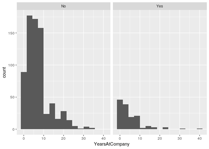
train %>%
  ggplot(aes(x = YearsAtCompany)) +
  geom_histogram(bins = 15) +
  facet_wrap( ~ Attrition, scales = 'free') +
  scale_fill_few(palette = 'Dark') +
  theme_few()
train %>%
  ggplot(aes(x = YearsInCurrentRole)) +
  geom_histogram(bins = 15) +
  facet_wrap( ~ Attrition, scales = 'free') +
  scale_fill_few(palette = 'Dark') +
  theme_few()
train %>%
  ggplot(aes(x = YearsSinceLastPromotion)) +
  geom_histogram(bins = 15) +
  facet_wrap( ~ Attrition, scales = 'free') +
  scale_fill_few(palette = 'Dark') +
  theme_few()
train %>%
  ggplot(aes(x = YearsWithCurrManager)) +
  geom_histogram(bins = 15) +
  facet_wrap( ~ Attrition, scales = 'free') +
  scale_fill_few(palette = 'Dark') +
  theme_few()
All Factor Features vs Attrition
features.factor
##  [1] "BusinessTravel"           "Department"
##  [3] "Education"                "EducationField"
##  [5] "EmployeeNumber"           "EnvironmentSatisfaction"
##  [7] "Gender"                   "JobInvolvement"
##  [9] "JobLevel"                 "JobRole"
## [11] "JobSatisfaction"          "MaritalStatus"
## [13] "OverTime"                 "PerformanceRating"
## [15] "RelationshipSatisfaction" "StockOptionLevel"
## [17] "WorkLifeBalance"
train %>% ggplot(aes(x = BusinessTravel, fill = Attrition)) +
  geom_bar(position = 'fill') +
  coord_flip()
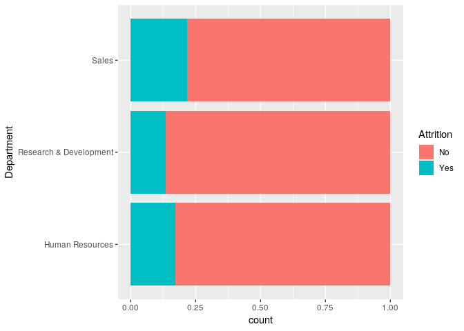
train %>% ggplot(aes(x = Department, fill = Attrition)) +
  geom_bar(position = 'fill') +
  coord_flip()
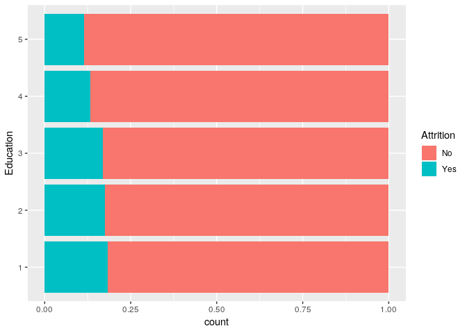
There appears to be some difference between education levels and attition.
train %>% ggplot(aes(x = Education, fill = Attrition)) +
  geom_bar(position = 'fill') +
  coord_flip()
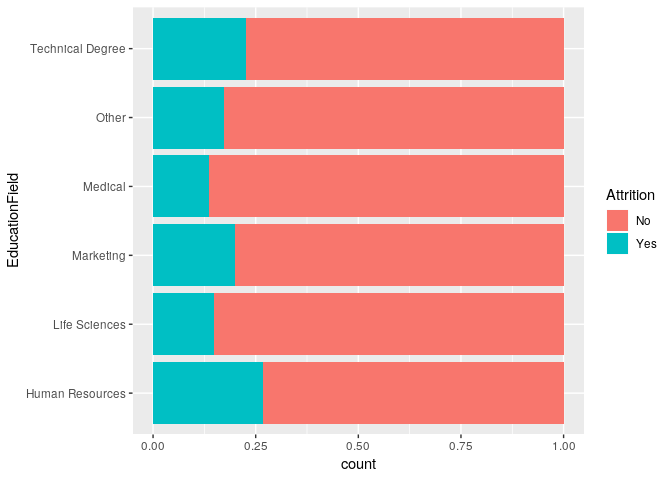
There appears to be some difference between education fields and attition.
train %>% ggplot(aes(x = EducationField, fill = Attrition)) +
  geom_bar(position = 'fill') +
  coord_flip()
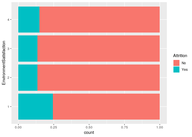
There appears to be some difference between environment satisfaction and attition.
train %>% ggplot(aes(x = EnvironmentSatisfaction, fill = Attrition)) +
  geom_bar(position = 'fill') +
  coord_flip()
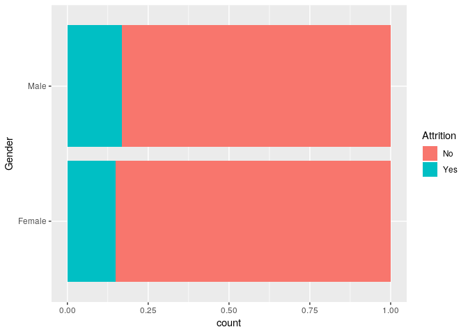
train %>% ggplot(aes(x = Gender, fill = Attrition)) +
  geom_bar(position = 'fill') +
  coord_flip()
Job involvement appears to have a big impact on attiriton
train %>% ggplot(aes(x = JobInvolvement, fill = Attrition)) +
  geom_bar(position = 'fill') +
  coord_flip()
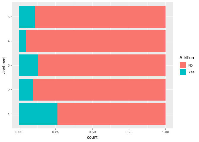
There is a correlation between job level and attrition
train %>% ggplot(aes(x = JobLevel, fill = Attrition)) +
  geom_bar(position = 'fill') +
  coord_flip()
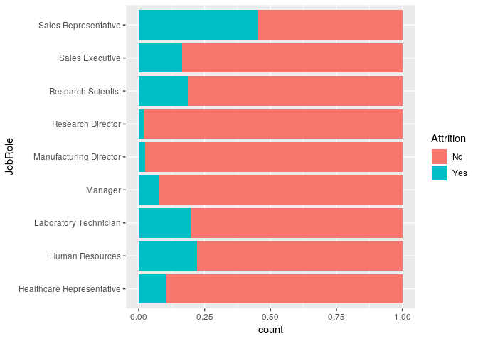
There is a correlation between job role and attrition
train %>% ggplot(aes(x = JobRole, fill = Attrition)) +
  geom_bar(position = 'fill') +
  coord_flip()
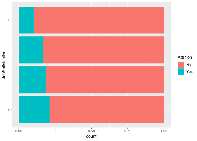
Job satisfaction appears to affect attrition
train %>% ggplot(aes(x = JobSatisfaction, fill = Attrition)) +
  geom_bar(position = 'fill') +
  coord_flip()
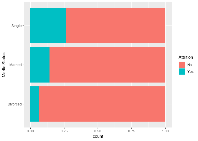
Marital status also correlates with attrition
train %>% ggplot(aes(x = MaritalStatus, fill = Attrition)) +
  geom_bar(position = 'fill') +
  coord_flip()
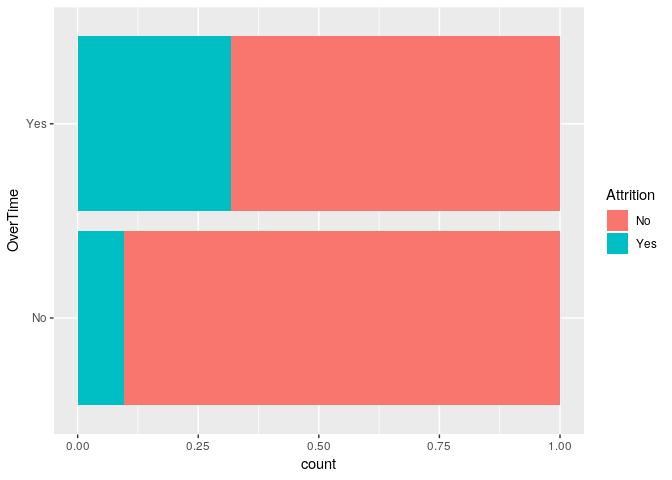
There appears to be a difference in attition related to overtime
train %>% ggplot(aes(x = OverTime, fill = Attrition)) +
  geom_bar(position = 'fill') +
  coord_flip()
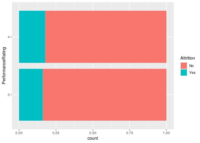
train %>% ggplot(aes(x = PerformanceRating, fill = Attrition)) +
  geom_bar(position = 'fill') +
  coord_flip()
train %>% ggplot(aes(x = RelationshipSatisfaction, fill = Attrition)) +
  geom_bar(position = 'fill') +
  coord_flip()

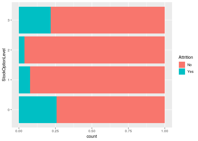
Stock option level appears to play a role in attition
train %>% ggplot(aes(x = StockOptionLevel, fill = Attrition)) +
  geom_bar(position = 'fill') +
  coord_flip()
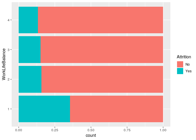
Work life balance appears to play a role in attirition
train %>% ggplot(aes(x = WorkLifeBalance, fill = Attrition)) +
  geom_bar(position = 'fill') +
  coord_flip()
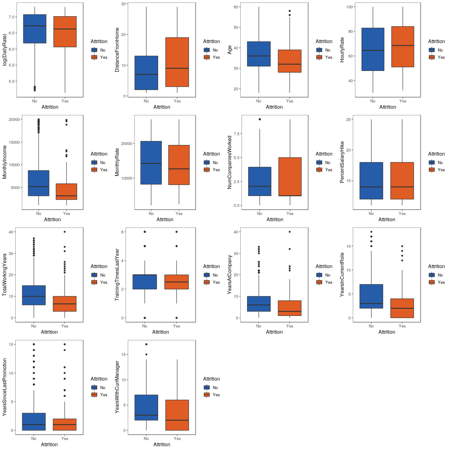
All Numeric Features vs Attrition
p1 <- train %>%
  ggplot(aes(x = Attrition,
             y = log(DailyRate),
             fill = Attrition)) +
  geom_boxplot() +
  scale_fill_few(palette = 'Dark') +
  theme_few()

p2 <- train %>%
  ggplot(aes(x = Attrition,
             y = DistanceFromHome,
             fill = Attrition)) +
  geom_boxplot() +
  scale_fill_few(palette = 'Dark') +
  theme_few()

p3 <- train %>%
  ggplot(aes(x = Attrition,
             y = Age,
             fill = Attrition)) +
  geom_boxplot() +
  scale_fill_few(palette = 'Dark') +
  theme_few()

p4 <- train %>%
  ggplot(aes(x = Attrition,
             y = HourlyRate,
             fill = Attrition)) +
  geom_boxplot() +
  scale_fill_few(palette = 'Dark') +
  theme_few()

p5 <- train %>%
  ggplot(aes(x = Attrition,
             y = MonthlyIncome,
             fill = Attrition)) +
  geom_boxplot() +
  scale_fill_few(palette = 'Dark') +
  theme_few()

p6 <- train %>%
  ggplot(aes(x = Attrition,
             y = MonthlyRate,
             fill = Attrition)) +
  geom_boxplot() +
  scale_fill_few(palette = 'Dark') +
  theme_few()

p7 <- train %>%
  ggplot(aes(x = Attrition,
             y = NumCompaniesWorked,
             fill = Attrition)) +
  geom_boxplot() +
  scale_fill_few(palette = 'Dark') +
  theme_few()

p8 <- train %>%
  ggplot(aes(x = Attrition,
             y = PercentSalaryHike,
             fill = Attrition)) +
  geom_boxplot() +
  scale_fill_few(palette = 'Dark') +
  theme_few()

p9 <- train %>%
  ggplot(aes(x = Attrition,
             y = TotalWorkingYears,
             fill = Attrition)) +
  geom_boxplot() +
  scale_fill_few(palette = 'Dark') +
  theme_few()

p10 <- train %>%
  ggplot(aes(x = Attrition,
             y = TrainingTimesLastYear,
             fill = Attrition)) +
  geom_boxplot() +
  scale_fill_few(palette = 'Dark') +
  theme_few()

p11 <- train %>%
  ggplot(aes(x = Attrition,
             y = YearsAtCompany,
             fill = Attrition)) +
  geom_boxplot() +
  scale_fill_few(palette = 'Dark') +
  theme_few()

p12 <- train %>%
  ggplot(aes(x = Attrition,
             y = YearsInCurrentRole,
             fill = Attrition)) +
  geom_boxplot() +
  scale_fill_few(palette = 'Dark') +
  theme_few()

p13 <- train %>%
  ggplot(aes(x = Attrition,
             y = YearsSinceLastPromotion,
             fill = Attrition)) +
  geom_boxplot() +
  scale_fill_few(palette = 'Dark') +
  theme_few()

p14 <- train %>%
  ggplot(aes(x = Attrition,
             y = YearsWithCurrManager,
             fill = Attrition)) +
  geom_boxplot() +
  scale_fill_few(palette = 'Dark') +
  theme_few()
grid.arrange(p1, p2, p3, p4, p5, p6, p7,
             p8, p9, p10, p11, p12, p13, p14)